Archia's Case Study
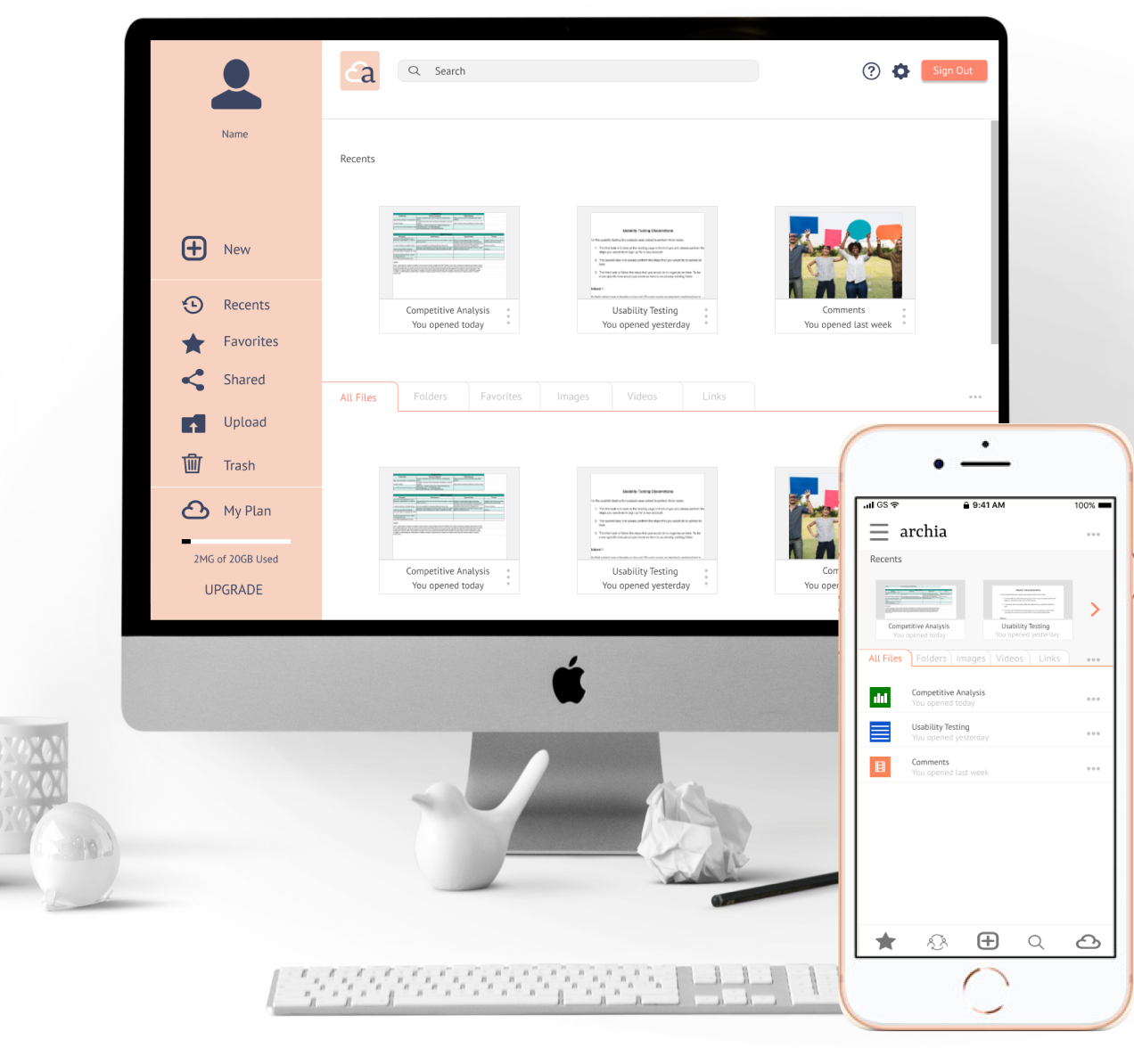
Archia is a cloud storage service that is looking to make its mark in the cloud storage market. Archia believes it can become one of the big players on the storage market by focusing on making its users satisfied while providing all the tools they need to accomplish their goals.
Roles
- -UX Designer
- -Visual Designer
- -Researcher
- -Prototyper
- -Brand and Identity

Deliverables
- -Desktop/mobile high fidelity mockups
- -Desktop/mobile PNGs of the mockups
- -InVision Prototype
- -Images
- -SVG Icons
- -Style Guide
- -Style guide on PNG and SVG format
- -SVG logos
Tools
- -Figma
- -InVision App
- -Usability Hub

The Problem
The client wants an app for a cloud storage service but they’re not sure what type of app they want. He gave as examples Google Drive, Dropbox, and Pinterest, etc. They only know that they want the app to be able to save content from the web, organize content, create content, upload content, and allow for collaboration.
The Solution
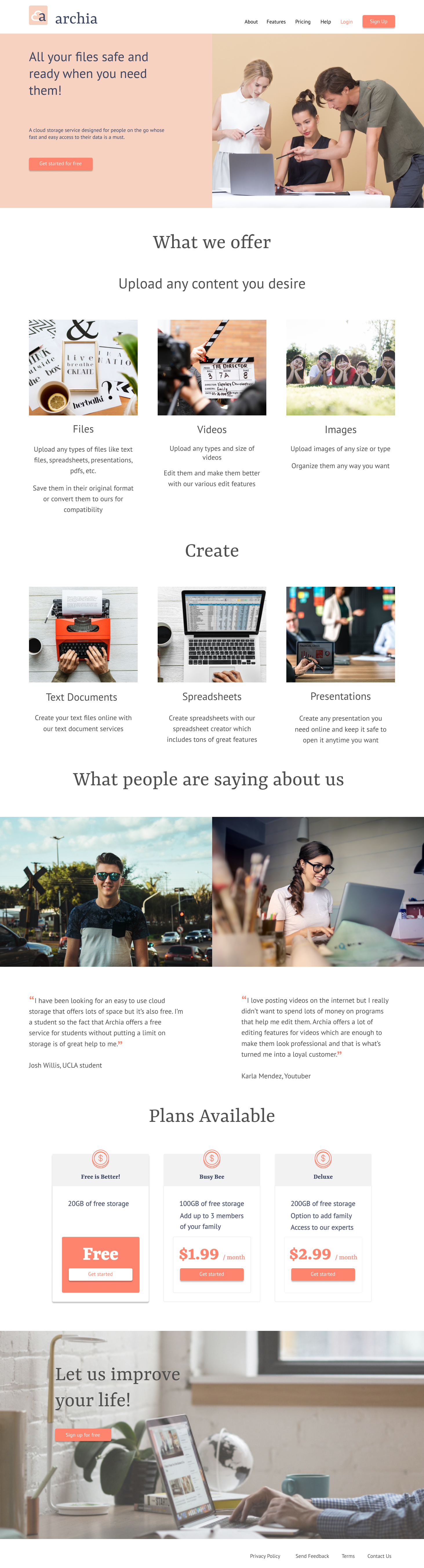
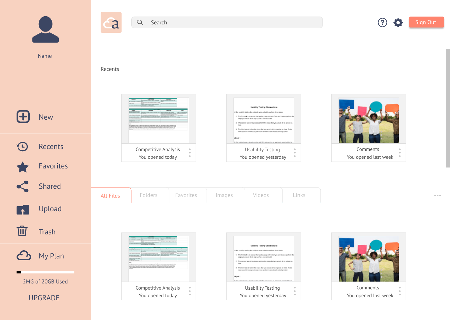
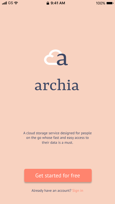
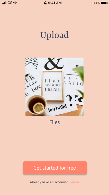
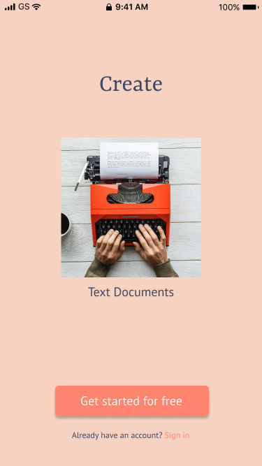
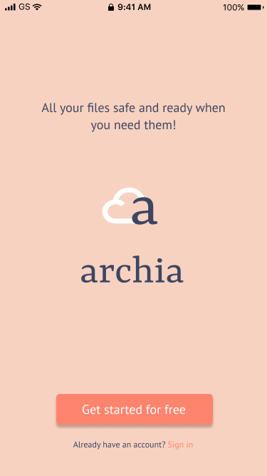
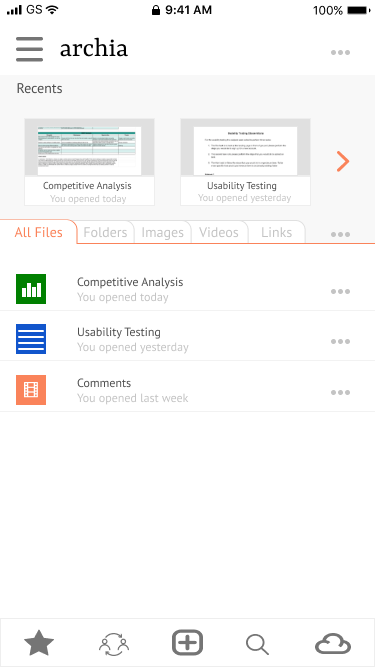
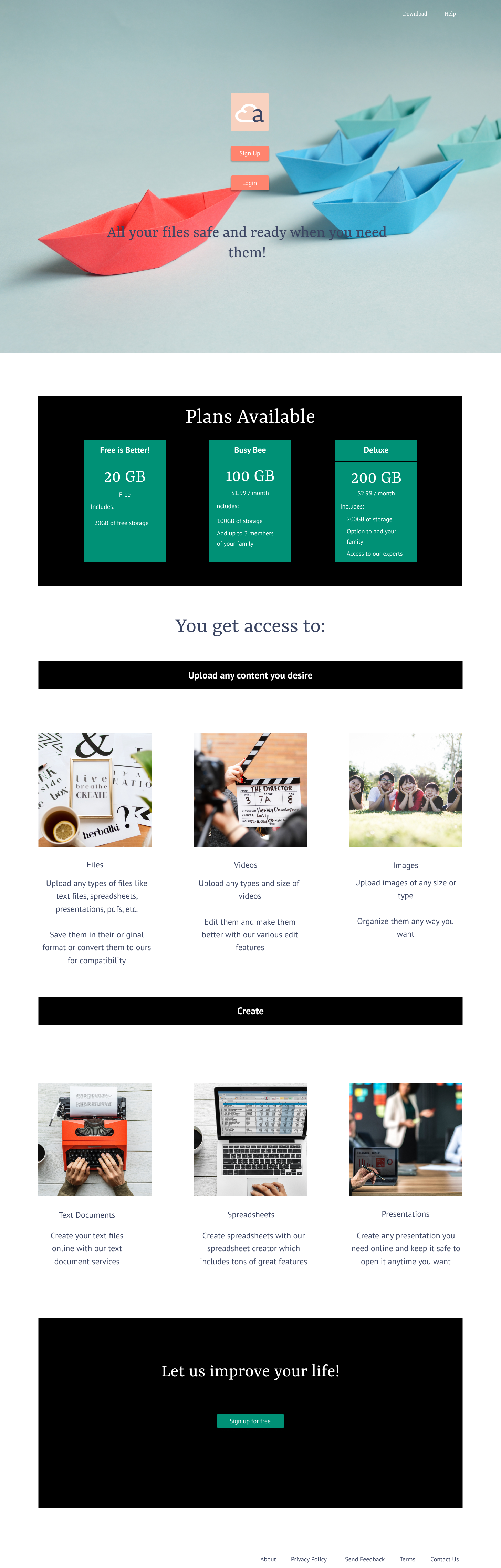
I created a cloud storage service that had the most important features according to my research. This is the final look of the landing pages and the dashboards.
The Process
User Research
After analyzing the results of my survey, I understood what type of user personas needed to be developed and what were the main features that needed to be included when designing the cloud storage service for the client.
Most Necessary Feautures
Where People Use Cloud Storage
74%
Of People surveyed have used a cloud storage service
91%
Of survey takers were female
48%
Were between 25-30 years old
Competitive Analysis
Since the client didn’t know the audience he was aiming for but gave as an example three of these competitors, Dropbox, Google Drive, and Pinterest, I decided to focus on researching those three.
These are some of the findings that I discovered after doing my competitive analysis of those three services:
- Dropbox and Google Drive offer similar services.
- Dropbox offers the original Microsoft Office, which includes Microsoft Word, Excel and Powerpoint, while Google Drive offers a very similar platform.
- Dropbox offers a 2GB of free storage while Google Drive offers 15GB.
- Pinterest doesn’t have a storage limit since it’s mostly used to save links of interesting things found on the web.
Analyzing these types of services next to each other helped me understand what would work and what wouldn’t in the creation of a cloud storage service. It showed me the things that I would need to focus in order to make the service more appealing to the users.
User Personas
After analyzing all the data on my survey and competitive analysis I was able to create two user personas that fit my research. One is a student and the other is a professional user. These individuals would be the primary audience to which the app needed to the aimed at.

Silvia
- Age: 26 years old
- Gender: Female
- Location: Dallas
Silvia is an early adopter. She loves anything that promises to make her life easier. She loves to keep her life organized and gets satisfaction from seeing things in their place. Wheneve r there’s a new product that promises to make tasks easier for her she’s the first one to check it out.
- To easyly create content online
- To quickly organize items on their specific folder
- To be able to access content online, anywhere, anytime
- That the saved data may get stolen
- That the content fails to sync in all platforms
- Not being able to collaborate live at the same time
Lilly
- Age: 18 years old
- Gender: Female
- Location: New York
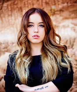
Lilly loves the interaction that social media has allowed people to have. She loves seeing people from different backgrounds connect with the click of a button. She hopes to someday create a social media that will also help people get closer to each other.
- To share content with multiple users faster
- To make interaction online safer
- To make collaboration easier
- Hates limitations on the storage available online
- No password options offered
- Content at risk of getting stolen
User Stories
For the user stories, I focused on the high priority items for all users but also included some medium and low priority items for what seemed was needed in order to create a minimum viable product.
All users high importance tasks:
- I want to sign in into an account
- I want to create new content
- I want to upload content from a computer or storage device
- I want to share a single item or a group or items with someone else and vice versa
- I want to connect with others for real-time collaboration
- I want to organize items into folders
- I want to sign out of the account
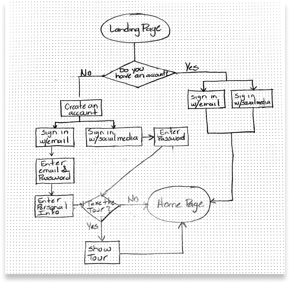
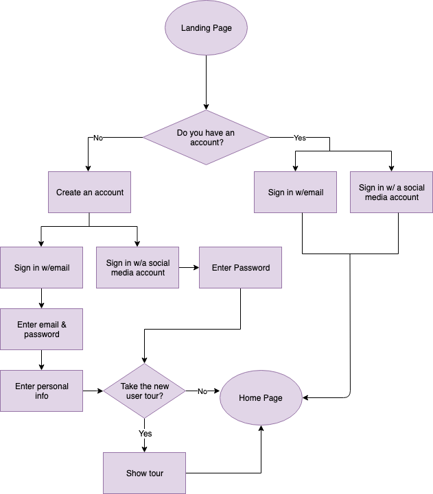
User Flows
User flows created based on user stories tasks and research:
- Create a new account/Login
- Create a new document
- Upload an item
- Organize content
- Share an item or items
- Favorite an item
- Collaboration
- Signing out
Wireframes
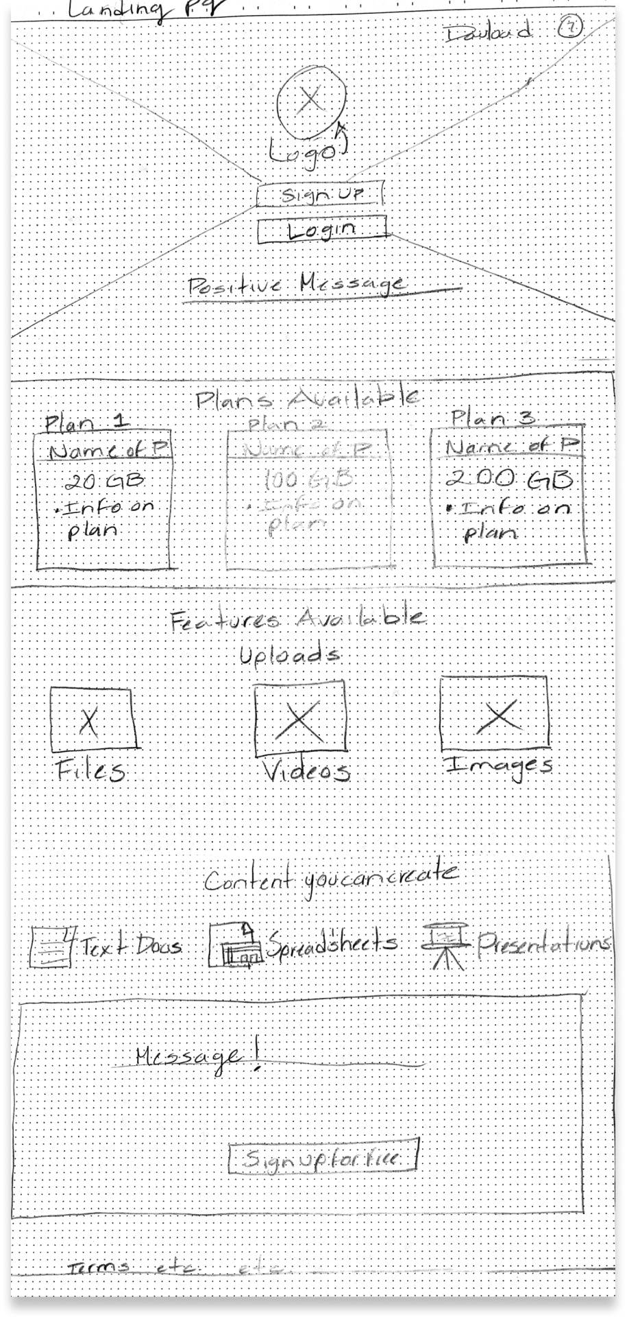
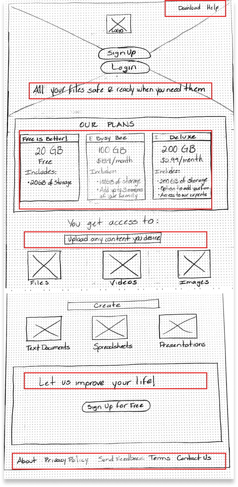
Below are a few of the many iterations that took to get to the final design that contain the minimum features to present the product to the client.
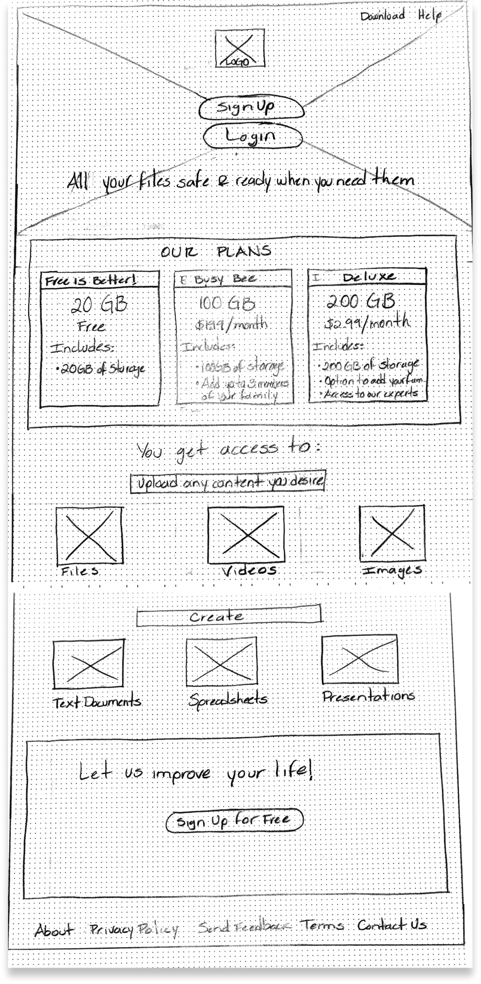
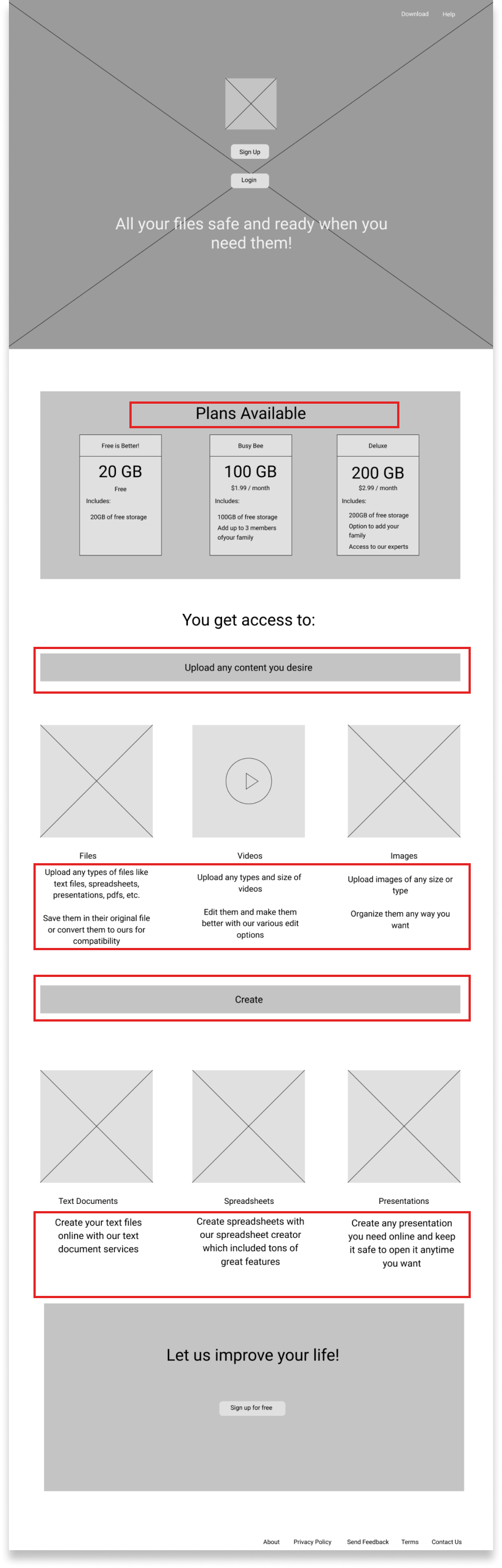
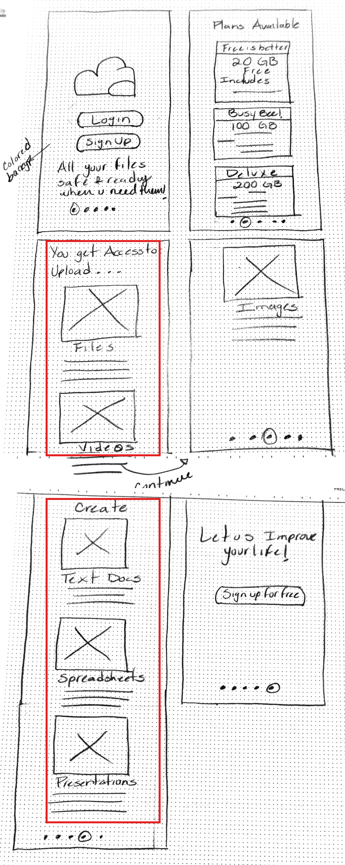
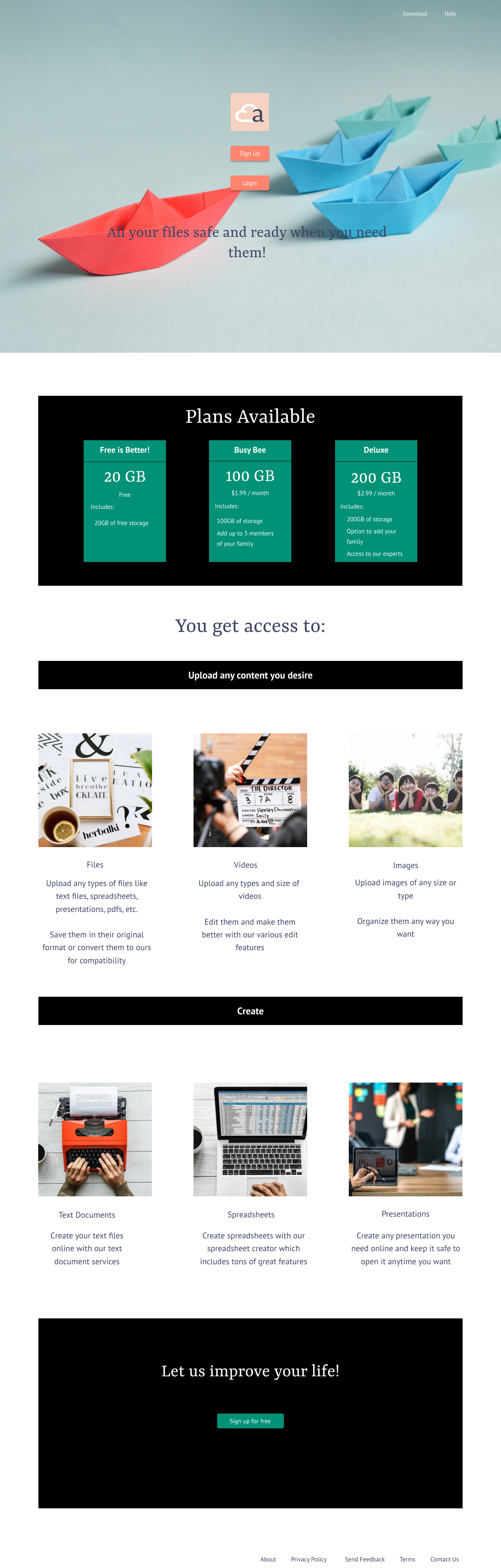
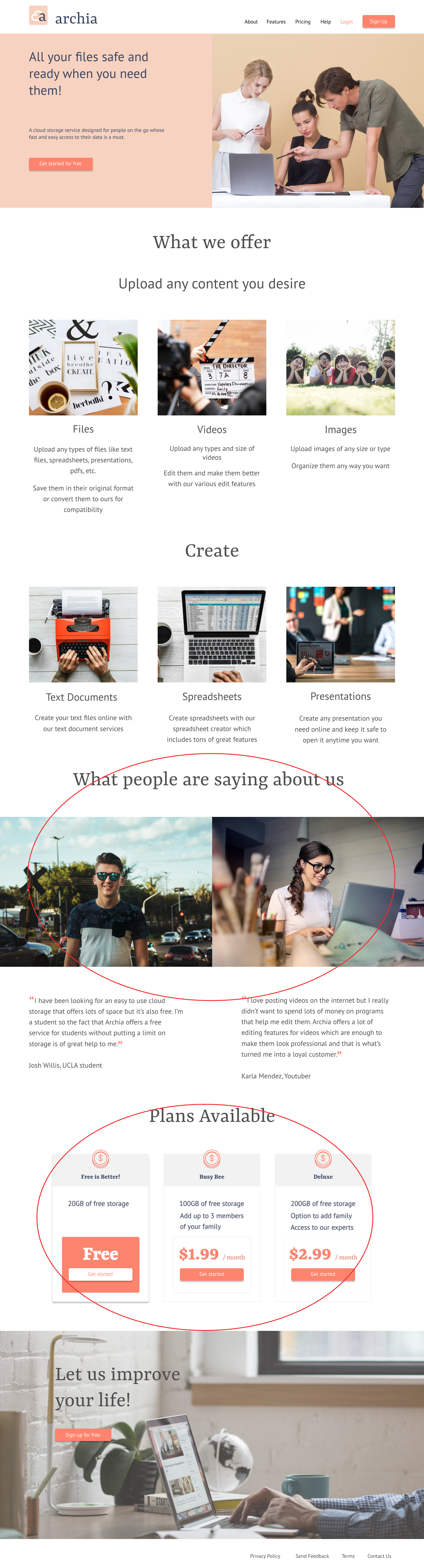
The first two images below are the first iterations of the sketch and the wireframes. The first image shows the first sketch I created and the second image shows the refined wireframe. In the wireframe for the desktop version you can see a few of the changes higlighted that I added after revising the sketch. More information was added as shown by changes in the red boxes. I added more detailed information like the plans availabe the cloud service would offer. I also added more visual changes to make the landing page more appealing.
The next two pictures show the first Figma wireframe and the parts highlighted in the red rectangles show the parts that were modified from the first wireframe. The headings for the uploading and creating sections were also matched with the margins of the plans to match the alignment of the previous section. After I received input, I also added some description below the headings under the pictures.
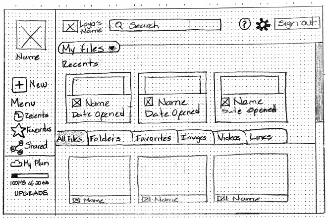
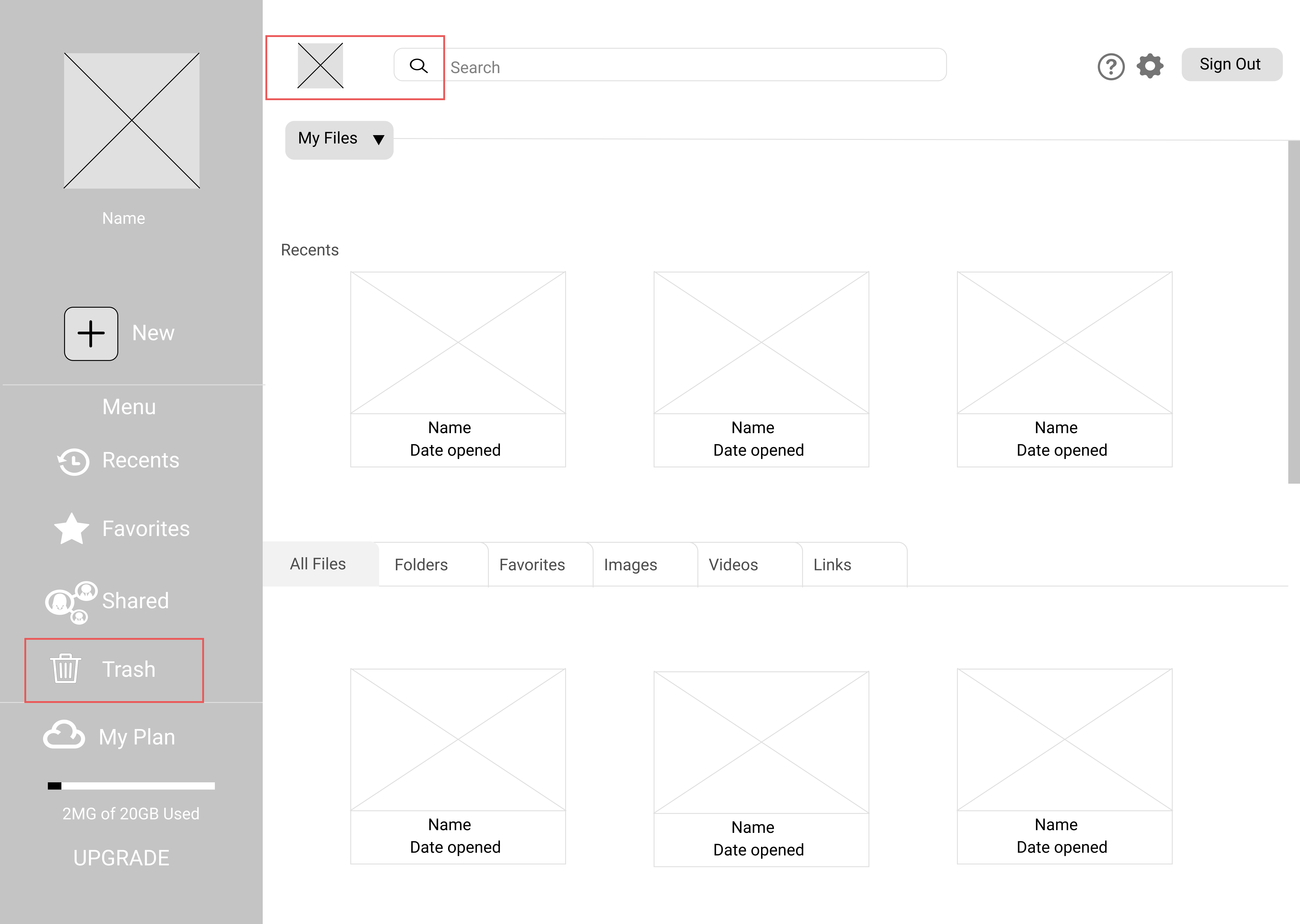
Finally below is just the hand drawn wireframe, shown in the first picture, and how it evolved when it was created on Figma. After I started creating the dashboard wireframe on Figma I realized that adding the logo's name seemed too much so I decided to remove it. I also added a trash icon to the menu since I had missed it before and I wanted it to be on an easy to find placehh for the user.
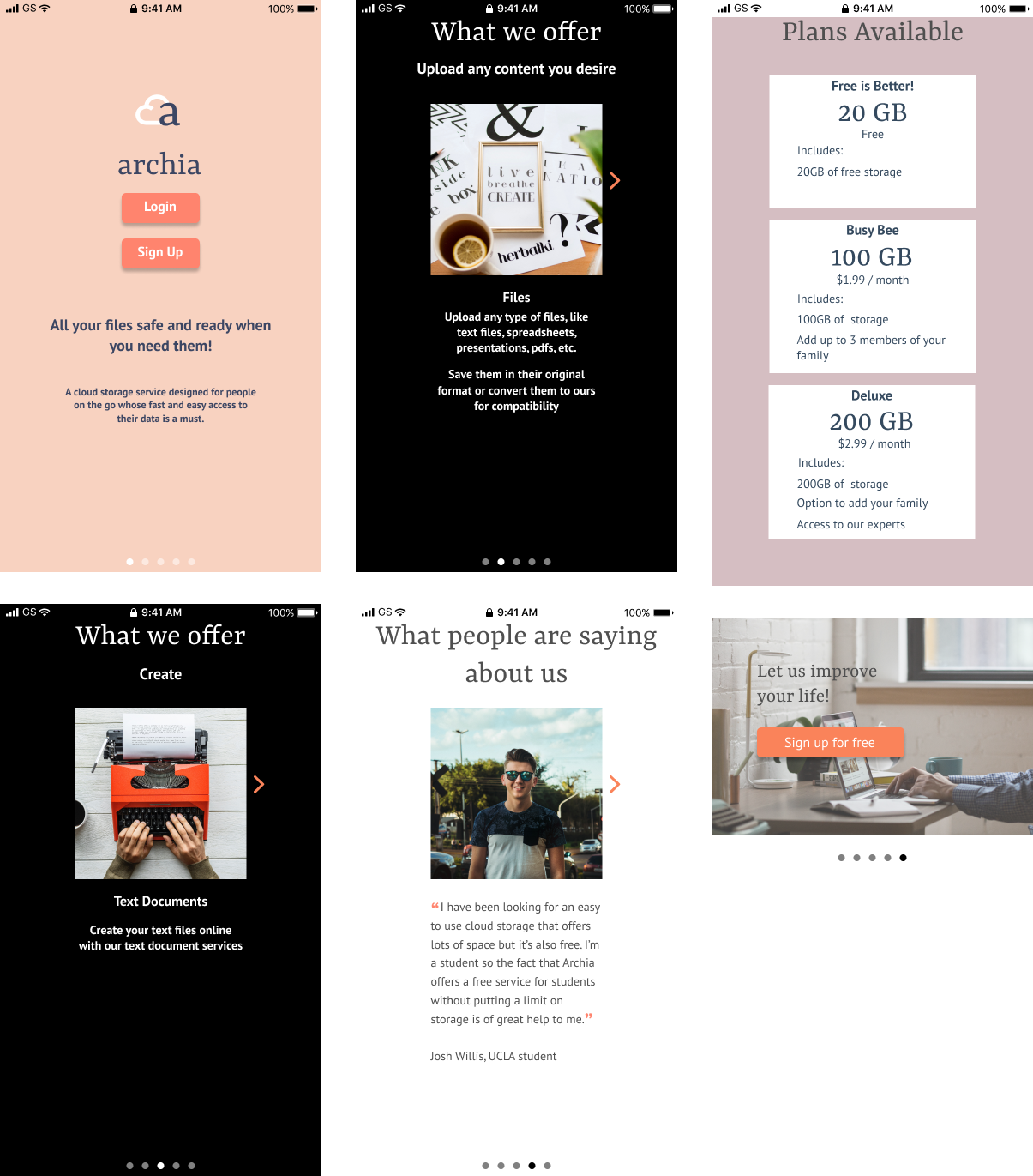
The two images below show the sketch and wireframe for the mobile version of the service. The first image is the mobile sketch for the landing page and on the second image is the wireframe. The second wireframe shows the changes I made after adding more details. First, I added the screen that would be the first screen shown when opening the app and I made the "login/sign up" screen the second screen. Other changes I made were that I made the "plans available" section more visually appealing plus I also added more information according to the changes made on the desktop version. In the "get access to" screen I decided to change how the images were shown by adding an arrow on the right side of the image to change to the next option instead of having the user sroll down to see the other options. These changes were also added to the "create" section to keep the same visual throughout the page.
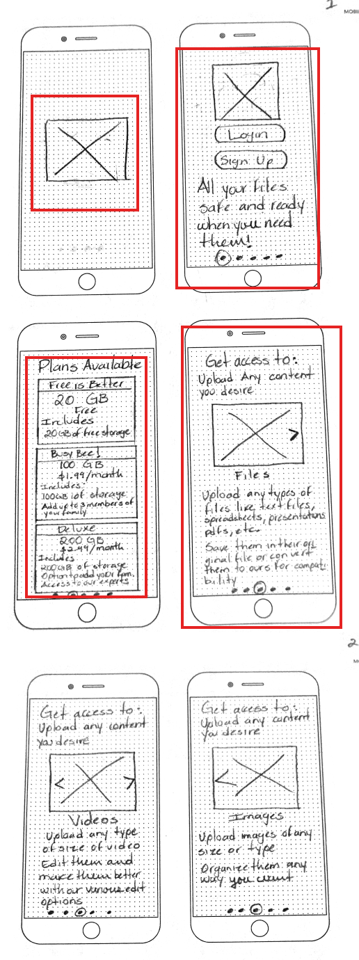
Finally, below shows the second iteration of the mobile wireframe and how it transformed after the third iteration was created on Figma.
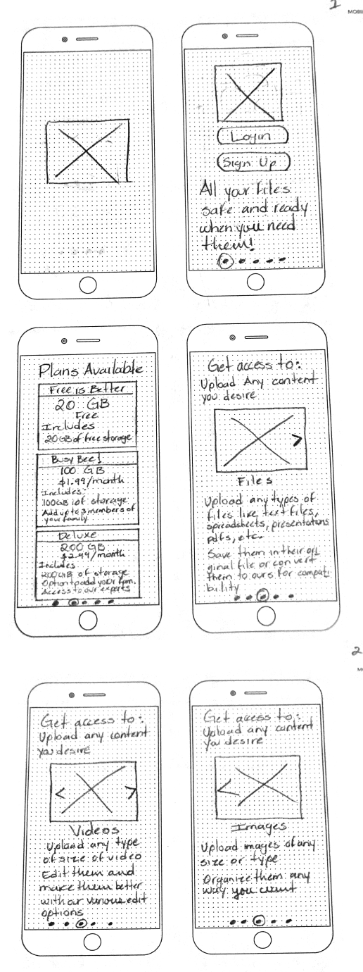
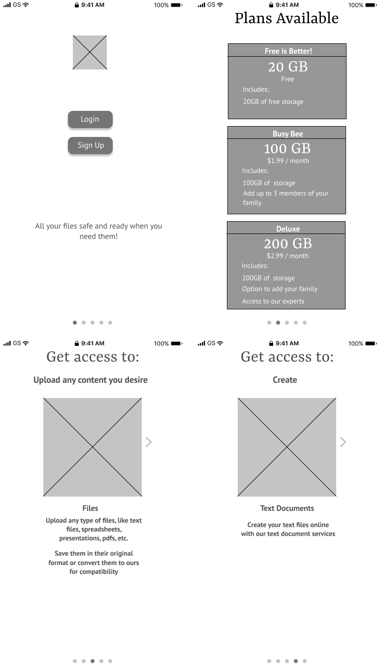
Mockups
After going from the sketches to the wireframes, I then moved onto creating the first iteration of the high fidelity mockups. Below I will explain in more details some of the changes that were applied after receiving input.
The first picture is the first attempt of the high fidelity mockup. The second image is the revised mockup after it was submitted to be graded. The rectangles in red show the main changes that were applied. I will go into more detail in the user testing section of this case study.
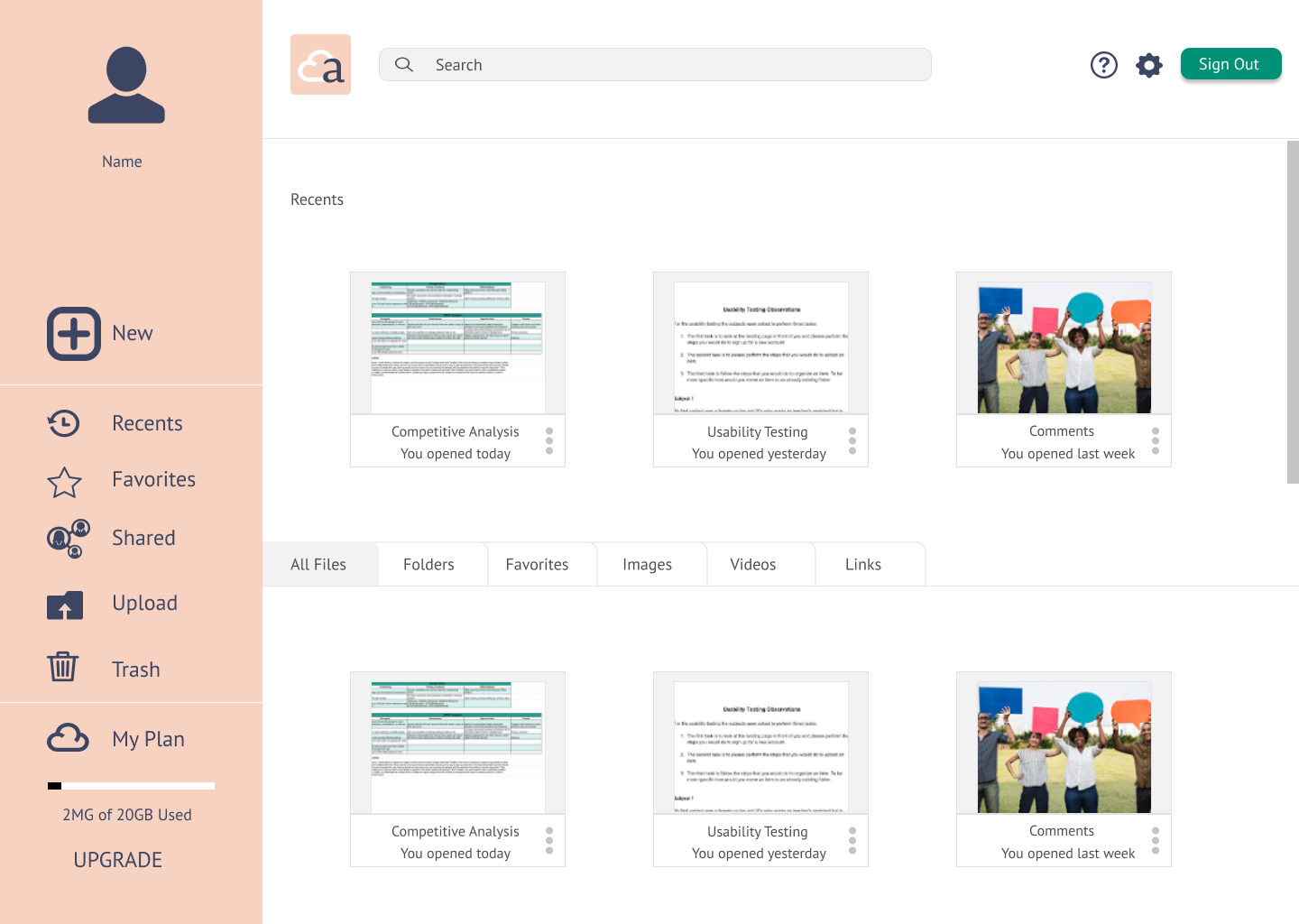
The iteration below is the second edited version of the high fidelity mockup for the desktop dashboard. More detailed explanation of how and what changes I made to it will be explained on the user testing section.
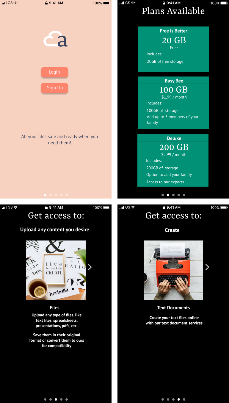
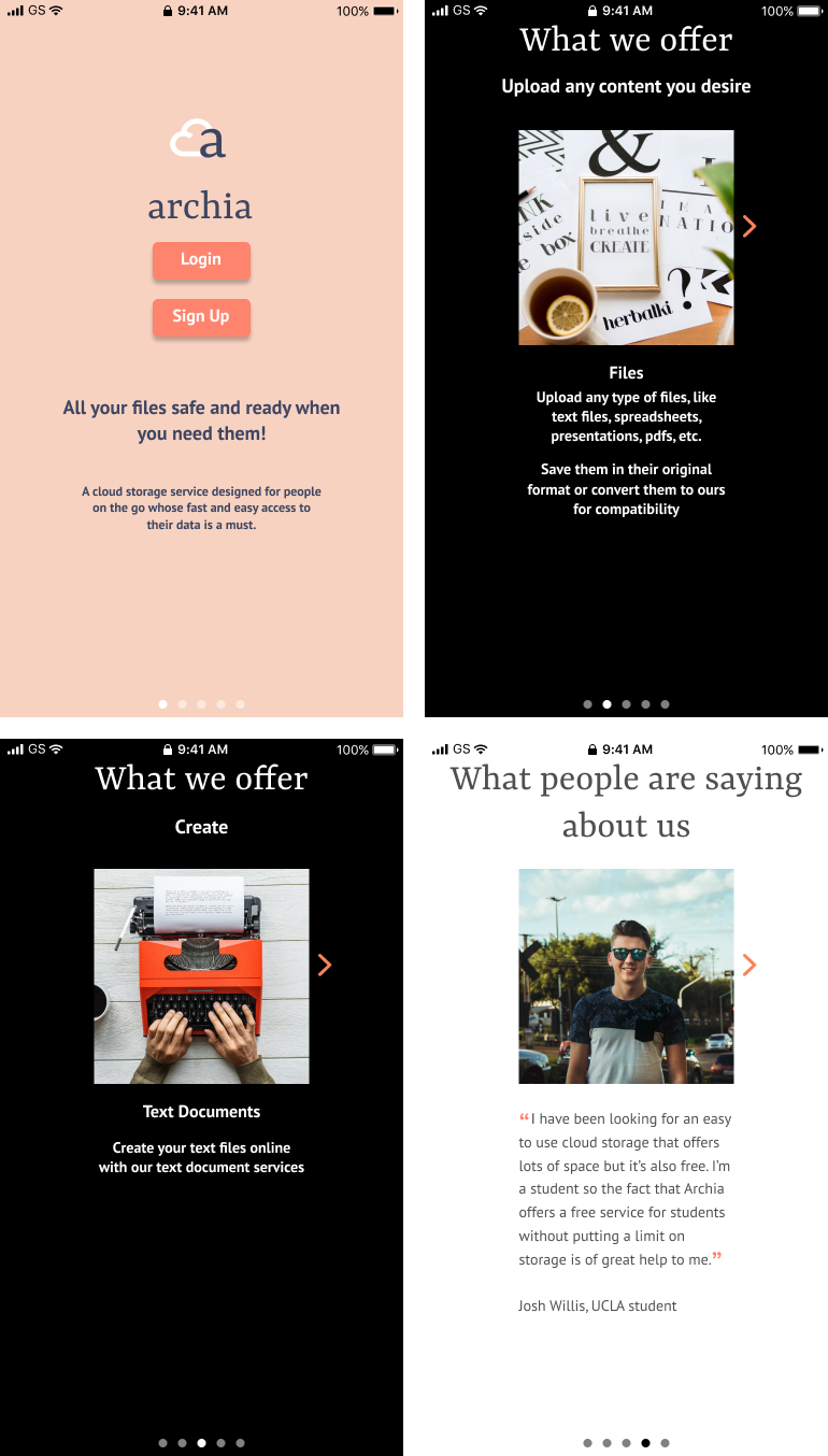
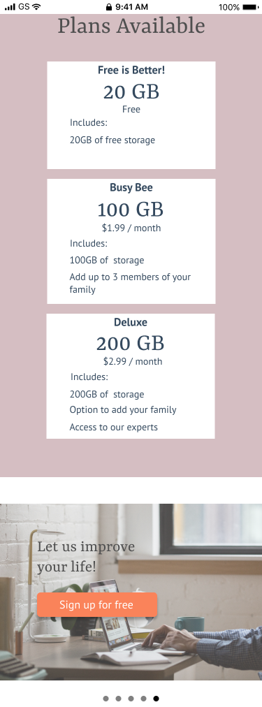
Below are the screens for the onboarding process for the mobile version of the cloud storage service. The first picture is the first try at the high fidelity mockups. The second picture was the second try, the changes applied to the second mockup were that the plans availabe tables were revised as well as I added the screen for the opinions of what the people are saying about the service.
Branding
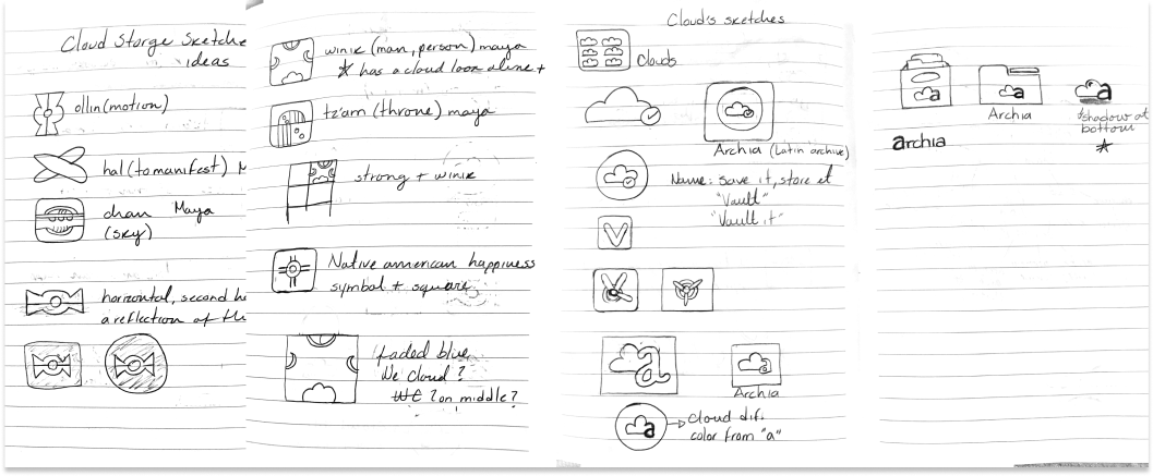
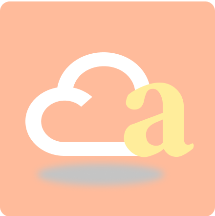
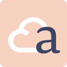
When I started sketching the logo I was going to use in my design I thought to research some Aztec or Mayan symbols to see if there was a symbol that represented a cloud but there was just some that represented the sky and one that had a cloud in it that was the symbol for a person. However, I found they didn’t really represent what the product did so I started sketching other options. Since I was designing a cloud storage service I decided that I needed to include a cloud in my design then at this point I was trying to figure out what to name it and I decided to look at the etymology of the word “archive” and found out that “archia” was a Latin origin for archive so I decided to use that for my design by adding the “a” into the cloud and then my logo evolved from there.
Color Palette
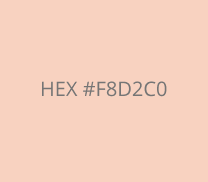
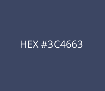
For the brand colors I wanted to give the brand a feel of security so I chose to go with a dark blue similar to the color of some police officers’ uniforms. After I chose to give the color blue to the “a” in the logo and make my cloud white I then chose the remaining color by finding a color that would match the blue I had already chosen. Below are the main colors chosen for the brand.
Typography
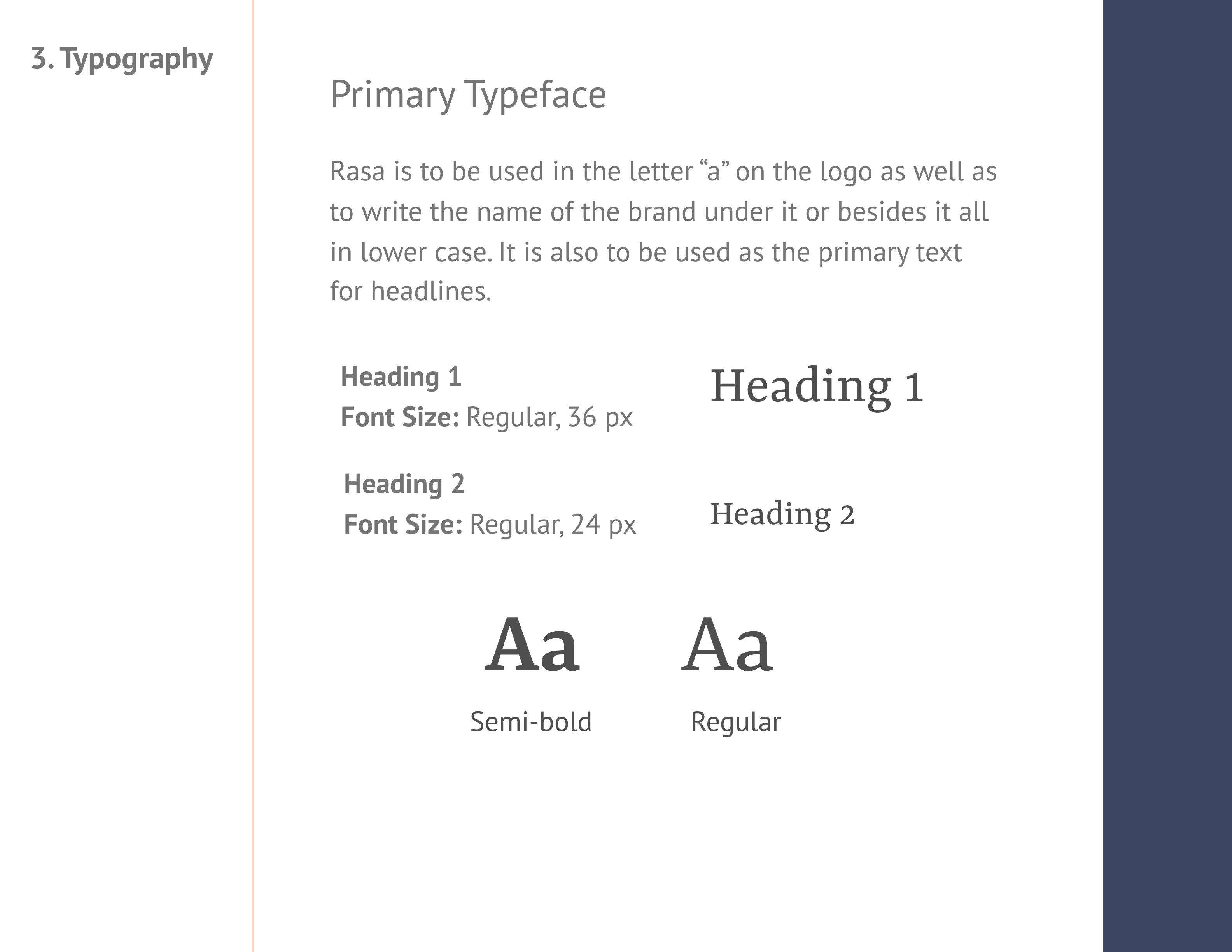
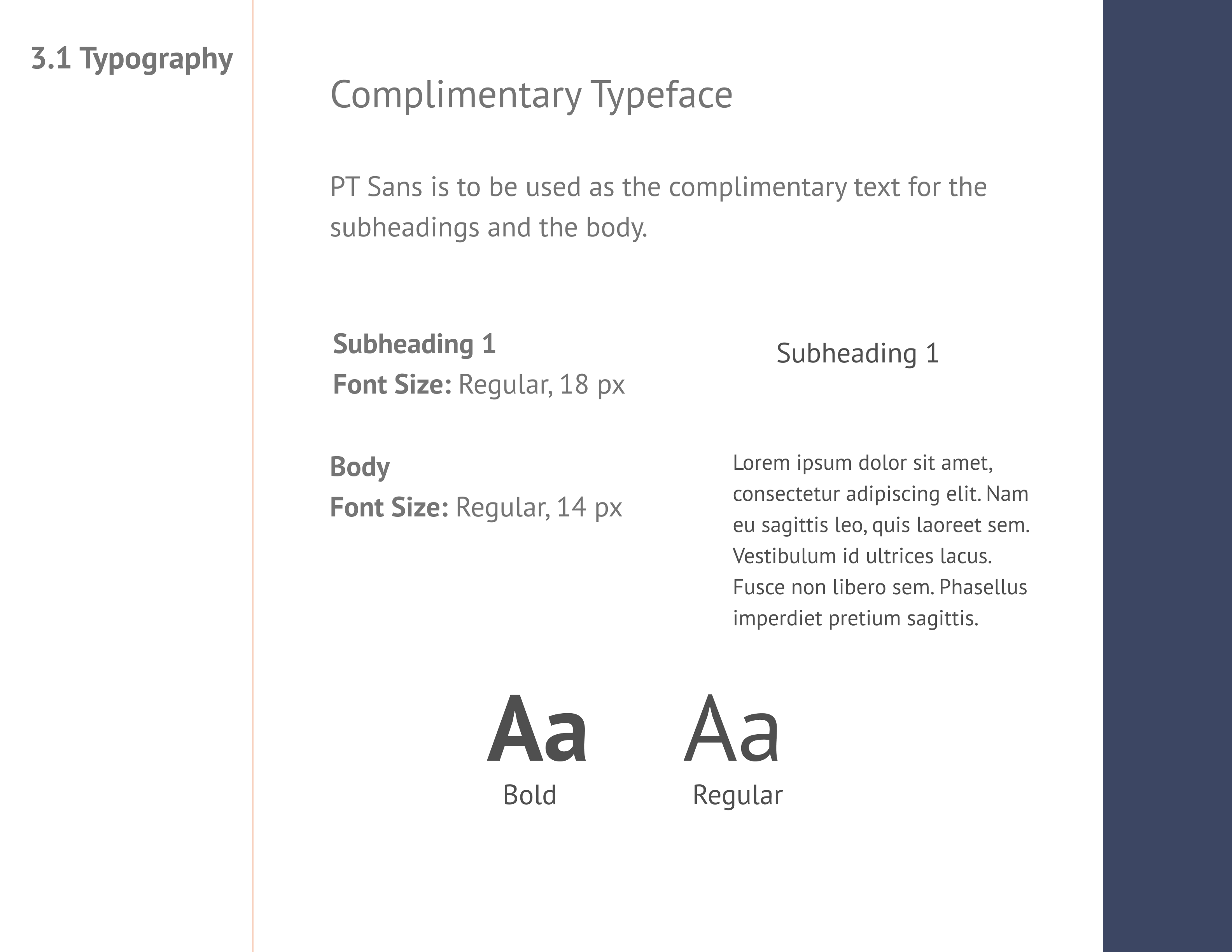
For the typography for the cloud storage I wanted to choose a font that conveyed simplicity and was easy to read. However for the prymary typeface I wanted to find a font that complimented the cloud in the logo, in this case that font was Rasa. For the complimentary font I chose to use PT Sans because it is easy to read and had that simplicity I wanted to implement but it also worked well with the prymary typeface.
Below is an image of the style guide that contains the primary face chosen, Rasa, and an explanation why I choose to use it in this design.
PT Sans is a humanist, sans-serif font and was chosen as the complimentary font for its easy readability.
High Fidelity Prototypes
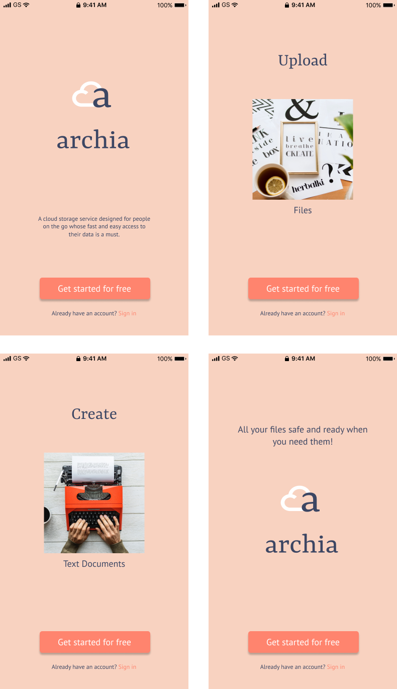
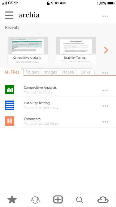
Finally, here are the final prototypes after multiple changes in colors and fixing the spacing on many things. Also, my final landing page changed a lot to make it look easier to navigate after the various inputs I received.
User Testing Results
During my first round of testing, I tested three subjects, two on-site and one remote. They were asked to perform three tasks:
- Sign up for a new account
- Upload an item
- Organize an item
Changes Applied
The change that was made after the first testing with three subjects was to add an “upload” button to the side menu to make it easier to find and therefore reducing the time when uploading an item.
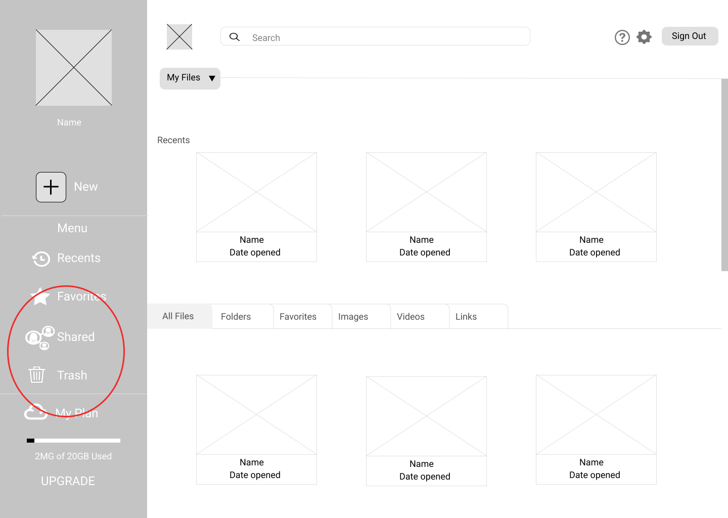
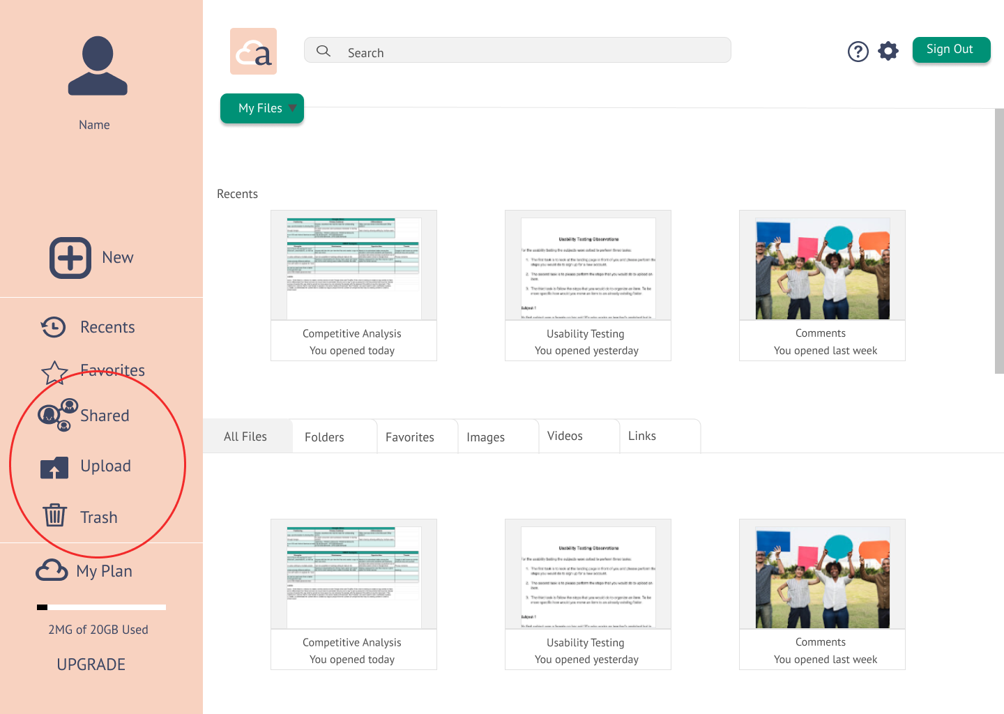
Other changes made after first testing was fixing the alignment on the side menu, removing the “my files” button since the tabs performed the same tasks and therefore was redundant, and changing the color of the “sign out” button to make it more compatible with the color used on the menu.
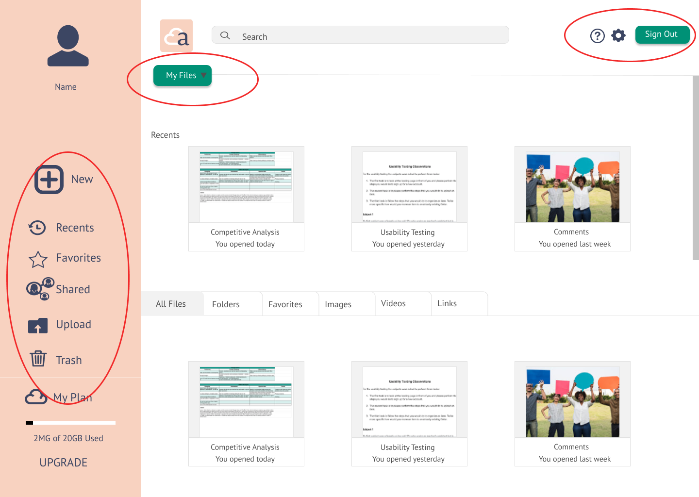
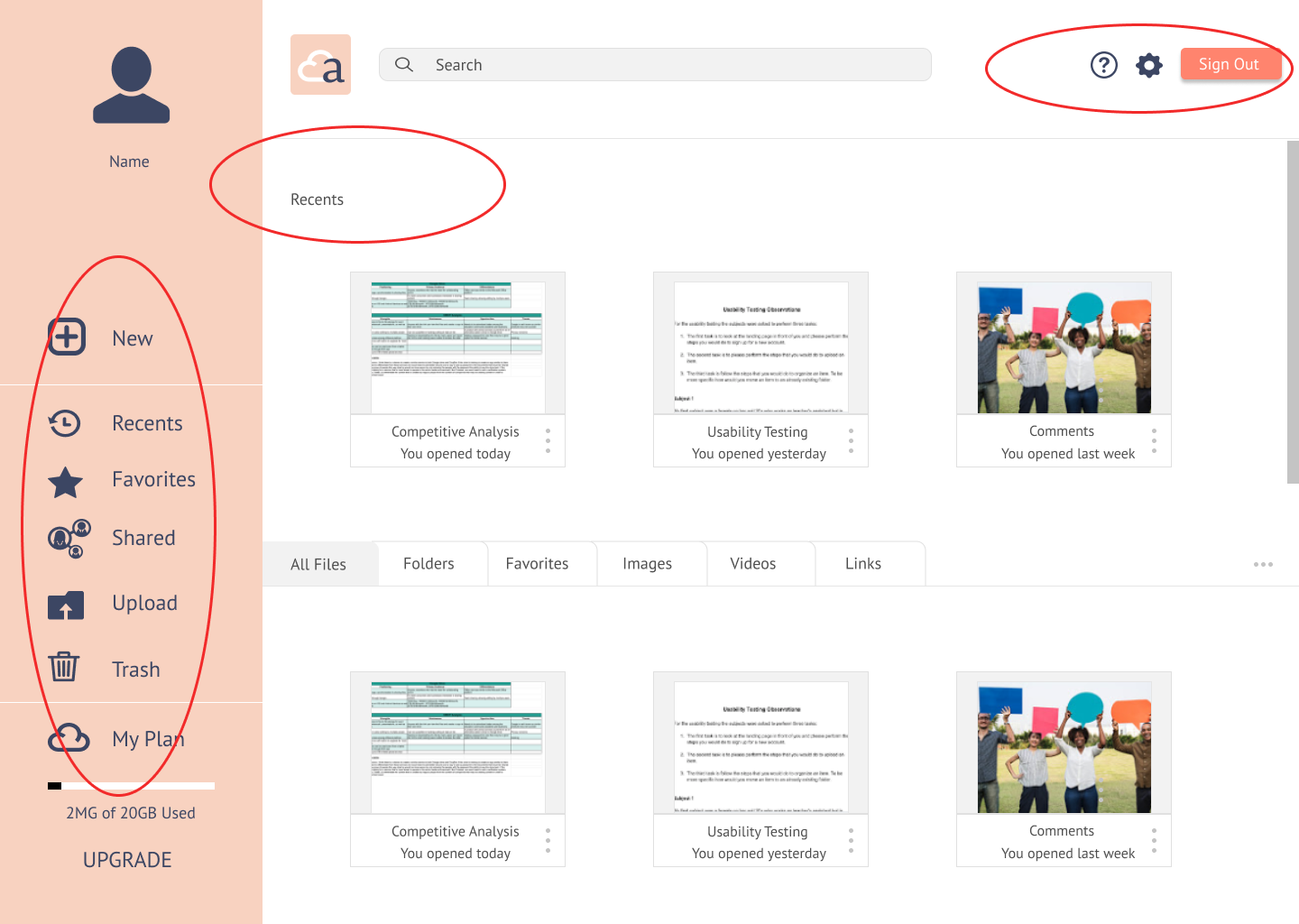
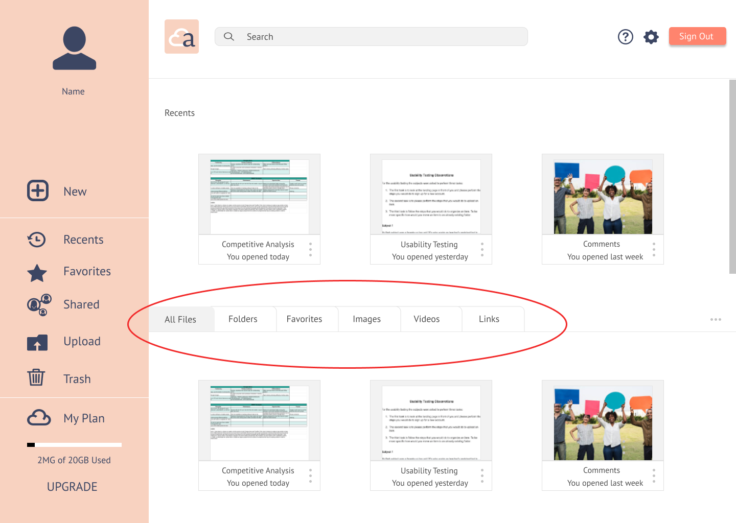
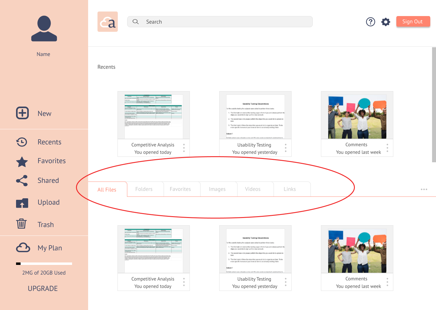
After my second round of testing, I changed the color of the lines on the tabs and muted the tabs not in use, since the subjects kept clicking on them when asked to organize a file into folders.
Other changes that I made after receiving input from my mentor was to improve my pricing tables since they still needed a little improvement and also move them almost at the end after the introduction of the features. Plus also added a section about what people using the service think of it to show prospective users how real people feel about the service.
Other changes made after receiving input from my mentor were to the mobile version. I was told that my onboarding had too many steps and that the color also needed to match my main colors more. The changes I did was to remove the sliding screen options and instead applied an auto rotating effect so the user would just have the option to sign in while seeing the features available.
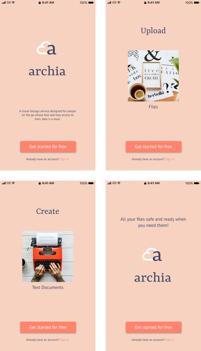
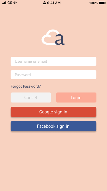
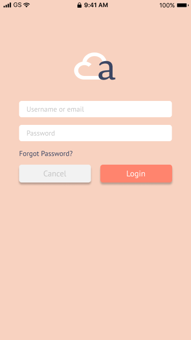
Other improvements were that I removed other social media buttons on the sign in/login page to both mobile and desktop versions to focus more on getting the users to use the client’s service.
Conclusion
In conclusion, I was surprised at how many steps it actually takes to make a barely functional prototype. Even though I didn’t design every single detail that still needs to be designed, I did an incredible amount of wireframes that even I was surprised by how they just kept coming. Every time I fixed something I had to go back and applied that change to all of the wireframes so it was very time-consuming.
I learned that I need to be careful with my spacing and alignment from the beginning because if I’m not doing it it will be time-consuming later trying to fix it on all wireframes. I also learned that I need to keep some type of journal with all the changes I’ve made along the way. That would help me when I have to write a case study like this for other projects, having a place with all the details that have been changed will ultimately save me a lot of time at the end.