Royal Cuisine's Case Study
Royal Cuisine is an Italian-American restaurant that is focused on creating the perfect dish from scratch to satisfy its customers while at the same time promises to invest in its community by buying local, homegrown products.
Roles
- -UX Designer
- -Visual Designer
- -Researcher
- -Prototyper
- -Brand and Identity

Deliverables
- -Desktop high fidelity mockups
- -Desktop PNGs of the mockups
- -Figma Prototype
- -Images
- -SVG Icons
- -Style Guide
- -Style guide on PNG and SVG format
- -SVG logos
Tools
- -Figma
- -Usability Hub

The Problem
The client wants a website that perfectly showcases every dish available on their menu to entice potential new customers. They also want to showcase their promise to the community of investing locally.
The Solution
Royal Cuisine’s website showcases all the important features that were supported by my research, such as a detailed menu with images, ingredients, and prices as well as other features the people surveyed found important such as the hours of the restaurant and the contact information.

The Process
User Research
The survey created for this design was to get to know what were the most important features customers think are must-haves on a restaurant’s website.
Reasons People Visit a Restaurant's Website
83%
Of People agreed contact information should be a main feature
Competitive Analysis
For my competitive analysis, I researched three restaurants Uncle Julio’s, Cheddar’s, and Spiral. Uncle Julio’s is a Tex-Mex restaurant that promises that its food is made from scratch. They have a very detailed menu but they lacked images and prices. One weakness on their menu was that the customers only get to see the prices of their dishes if they decide to order online. One strength is that they offered the opportunity to reserve right on their website through OpenTable.
Cheddar’s makes their menu the focal point of their landing page. This restaurant was the strongest on the visual presentation of their food. Their menu shows pictures for their dishes and included a description of ingredients as well as prices. The two main options on their website are their Menu and Location since this is the restaurant with the most locations they made easy to access their contact information this way.
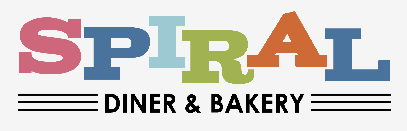
Spiral is a vegan and vegetarian restaurant. Their website offers a great menu which included the prices and well-detailed description of the ingredients but lacks images of the dishes. Their contact information can be found on the Contact option of their menu and also at the bottom of the page on their Menu page. They also made their social media, Facebook and Instagram, as part of their menu on the landing page but they disappear after clicking on the menu.
While I was researching these three restaurants I saw what I wanted to include in my design. I saw how they implemented the main features that the people who were surveyed said were important to them such as the menu with pictures, ingredients, and prices, as well as how they displayed their contact information, and also their about page. Analyzing these restaurants made me get an idea of what I wanted my design to include and how to display it better in a way that would satisfy the vision of my client.
User Personas
After gathering the data from my survey participants and analyzing the research from my competitive analysis I was able to develop three user personas, two of which are shown below. For exploring all the personas in more detail click on the button below the personas information.

Mary Evans
- Age: 28 years old
- Gender: Female
- Location: New York
Mary loves to visit websites for the restaurants she’s planning to visit during her lunch. She usually looks to see if they offer a lunch special and then just browses through the rest of the menu to check the ingredients that make up the dish to try to guess the overall flavor of it.
- To find the contact information quickly
- To be able to order online
- To be able to see what are the ingredients on every dish
- Having to scroll to the end of the page in order to find the address
- Not seeing a description of the ingredients on the dish
- Not seeing if they offer delivery services

Will Jones
- Age: 32 years old
- Gender: Male
- Location: Los Angeles
Will visits restaurants’ websites frequently. He’s self employed and often needs a place to meet with clients so checking out the place before he goes there is always a must. He also loves to check their social accounts for feedback.
- To find the contact information
- To be able to make a reservation online
- To be able to see the price and information
- Don’t offer a chance to make reservations online
- No allergy information available
- Difficult to find links to their social medias
User Stories
The user stories below showcase only the high importance items all users found to be important to be shown in a menu for a restaurant. These items are what needs to be the main focus when designing the website.
All users high importance tasks:
- I want see the contact information
- I want to see a menu with pictures
- I want to upload content from a computer or storage device
- I want to see the ingredients of the dishes
- I want to see the prices
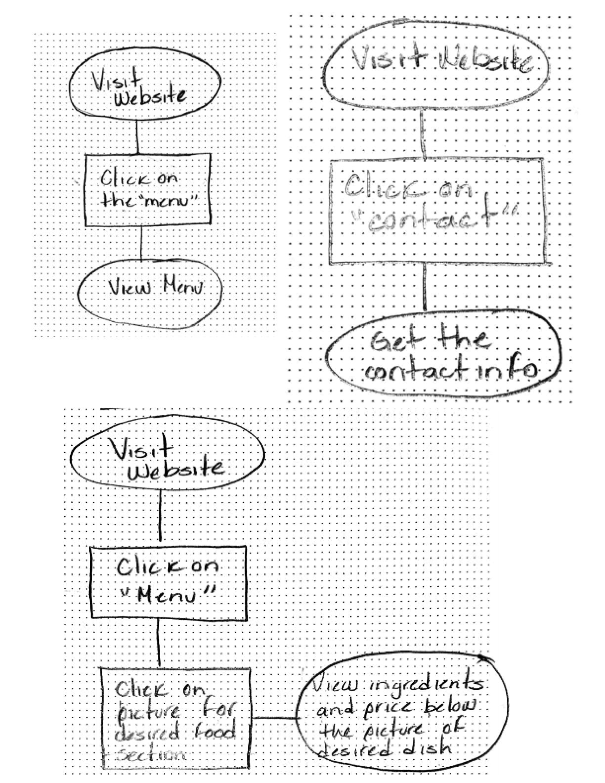
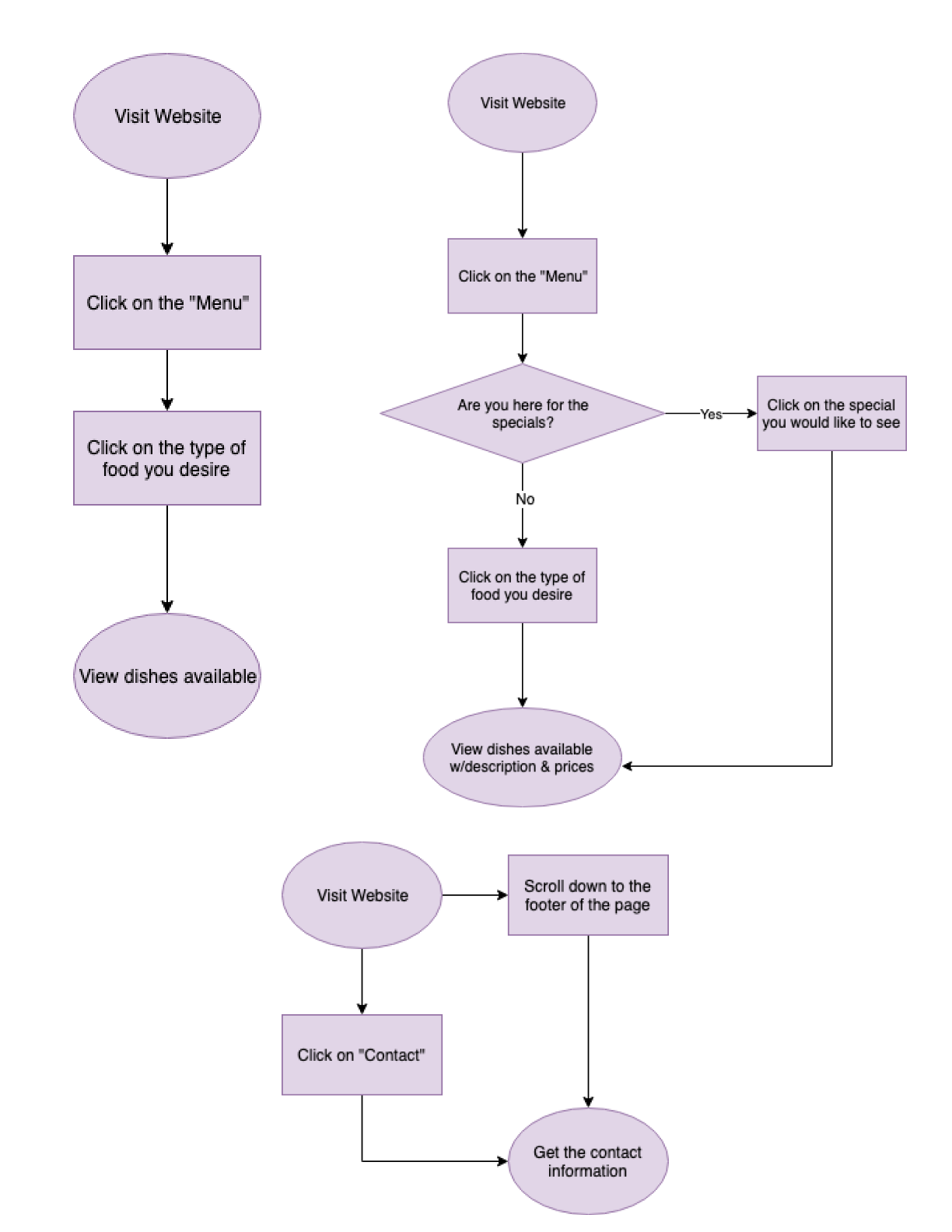
User Flows
After analyzing the high priority tasks from the user stories I developed five user flows for:
- Viewing the menu
- Viewing the contact information
- Viewing ingredients and prices
- Viewing the specials
- Viewing the delivery services
Wireframes
This section showcases the evolution of my design from step to step. The images show how I started from my first sketch and reached my final design.
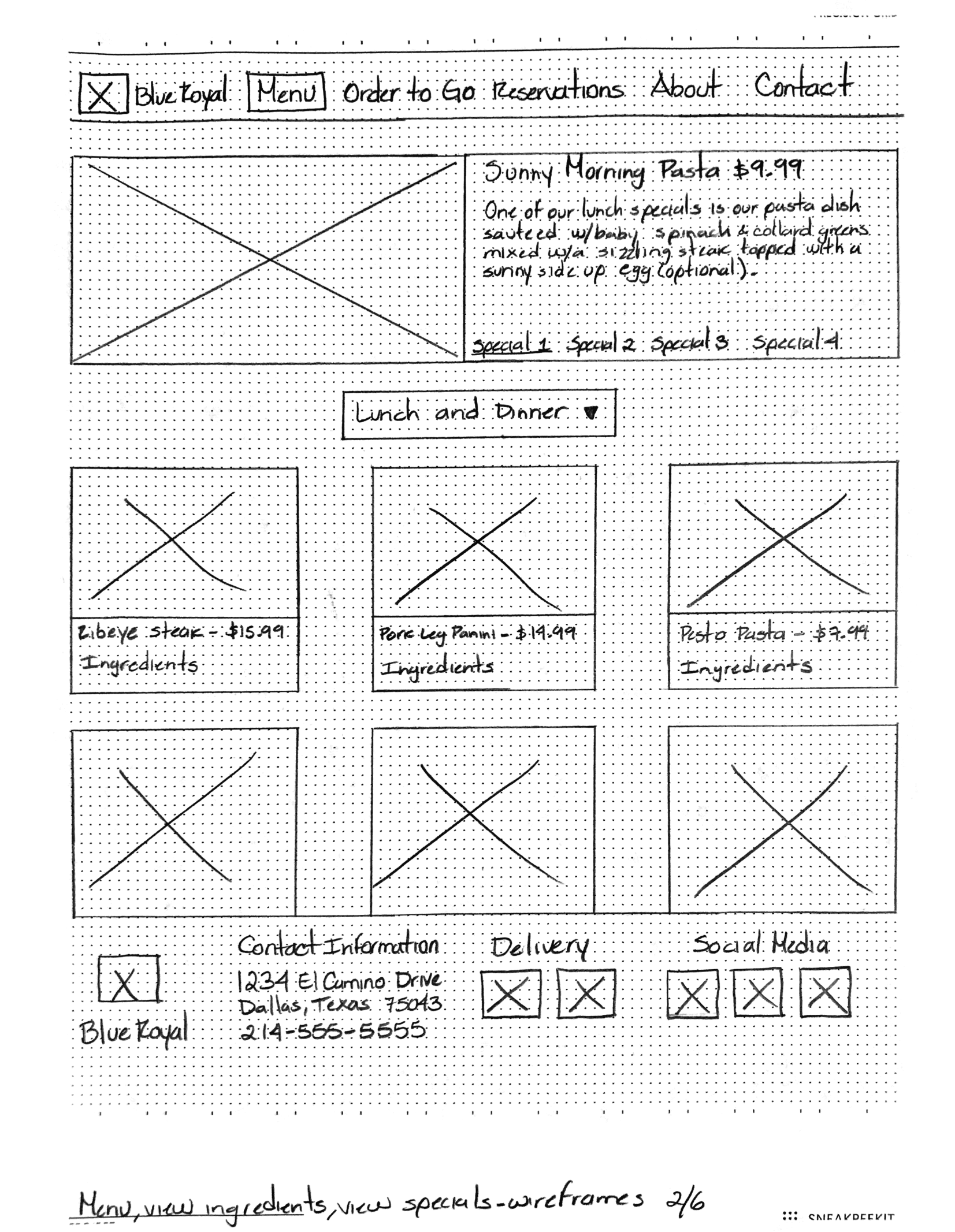
On the left is the first sketch created for the project with just a rough idea of the things I wanted to include in the landing page of the restaurant. On the right, is the first wireframe showing more information about the restaurant missing on the first sketch.
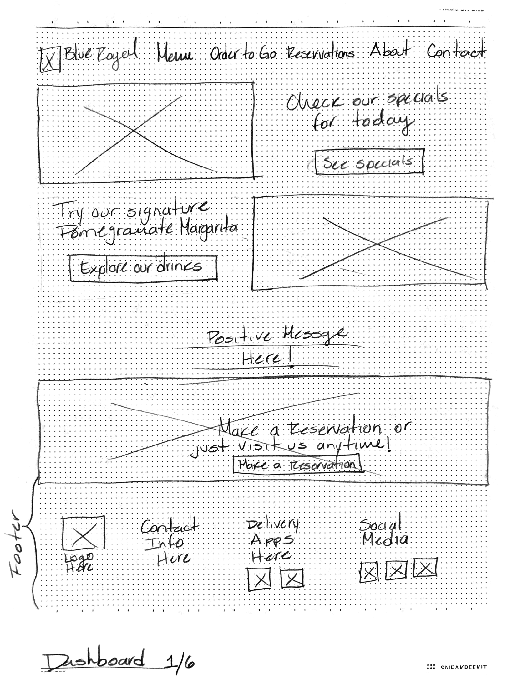
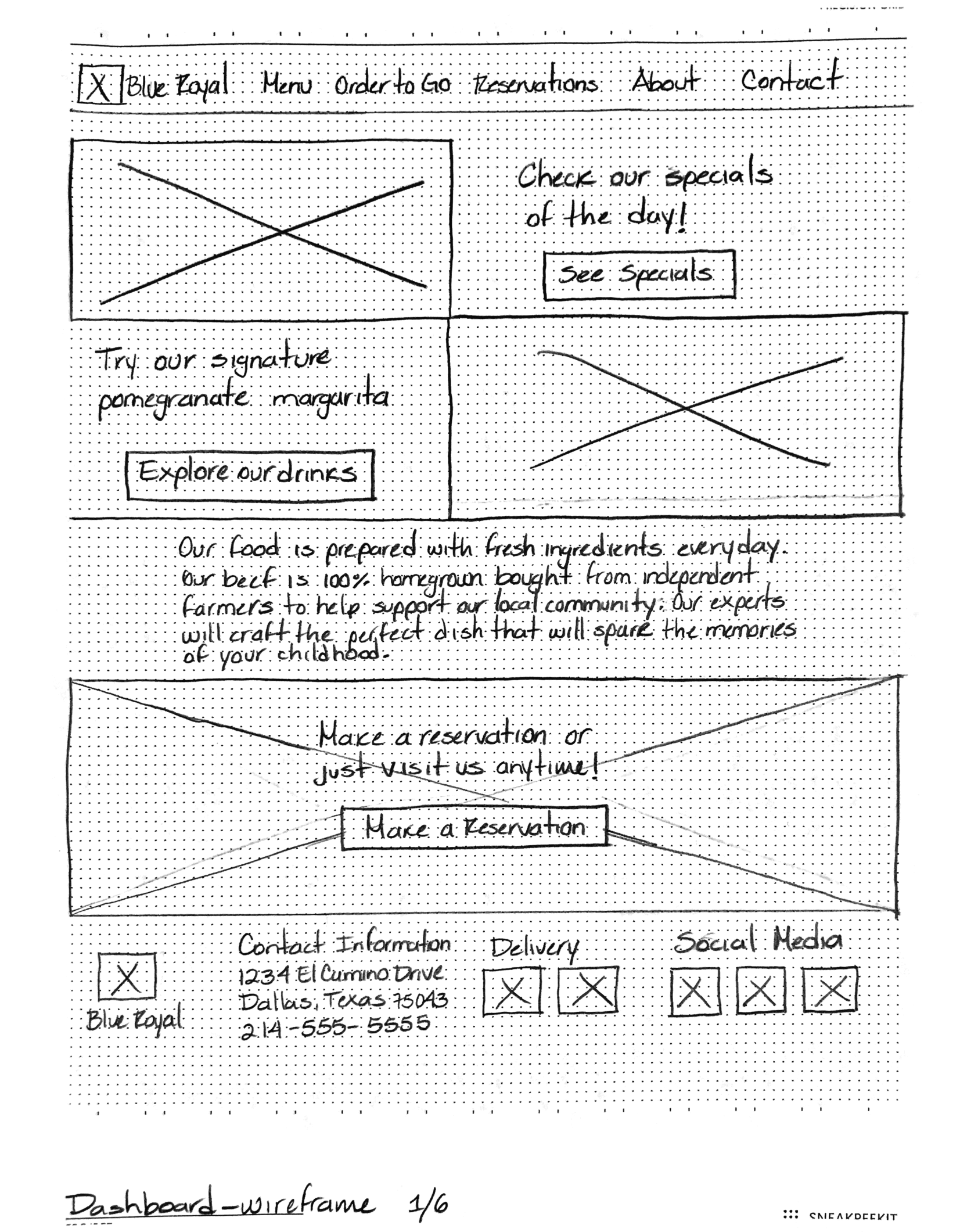
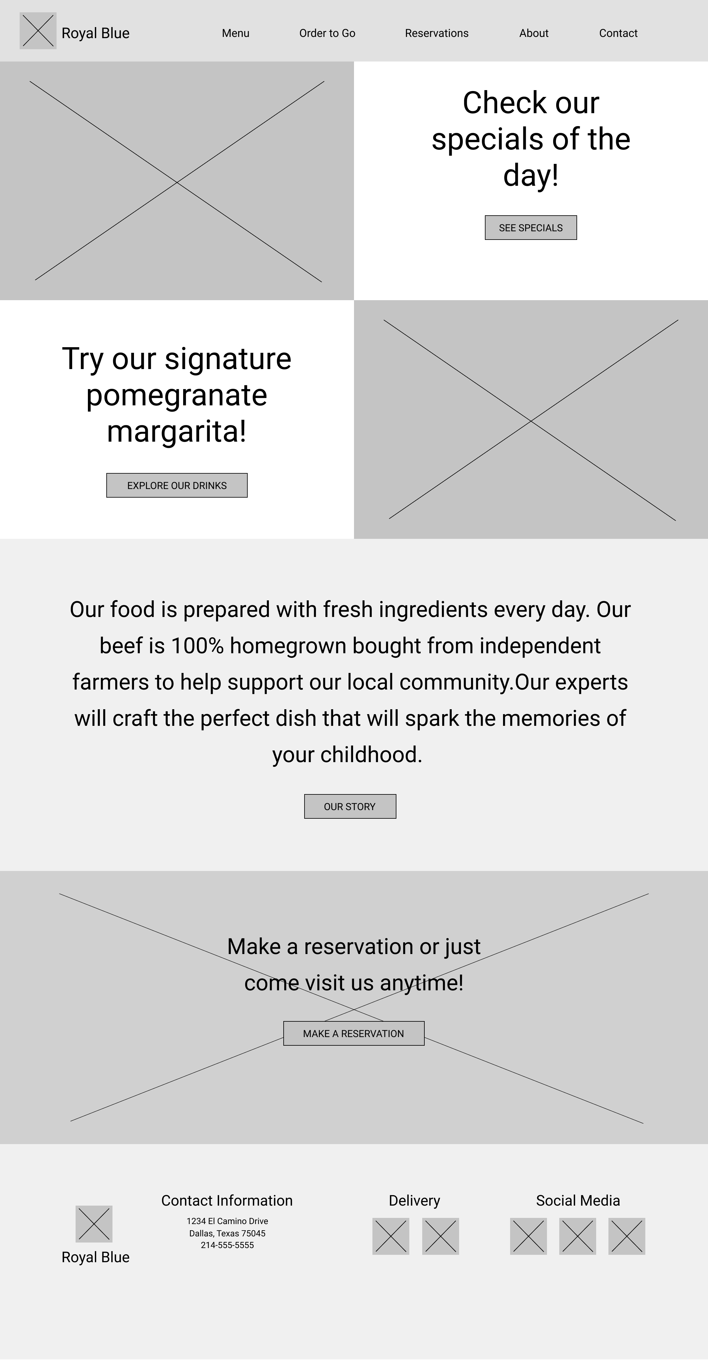
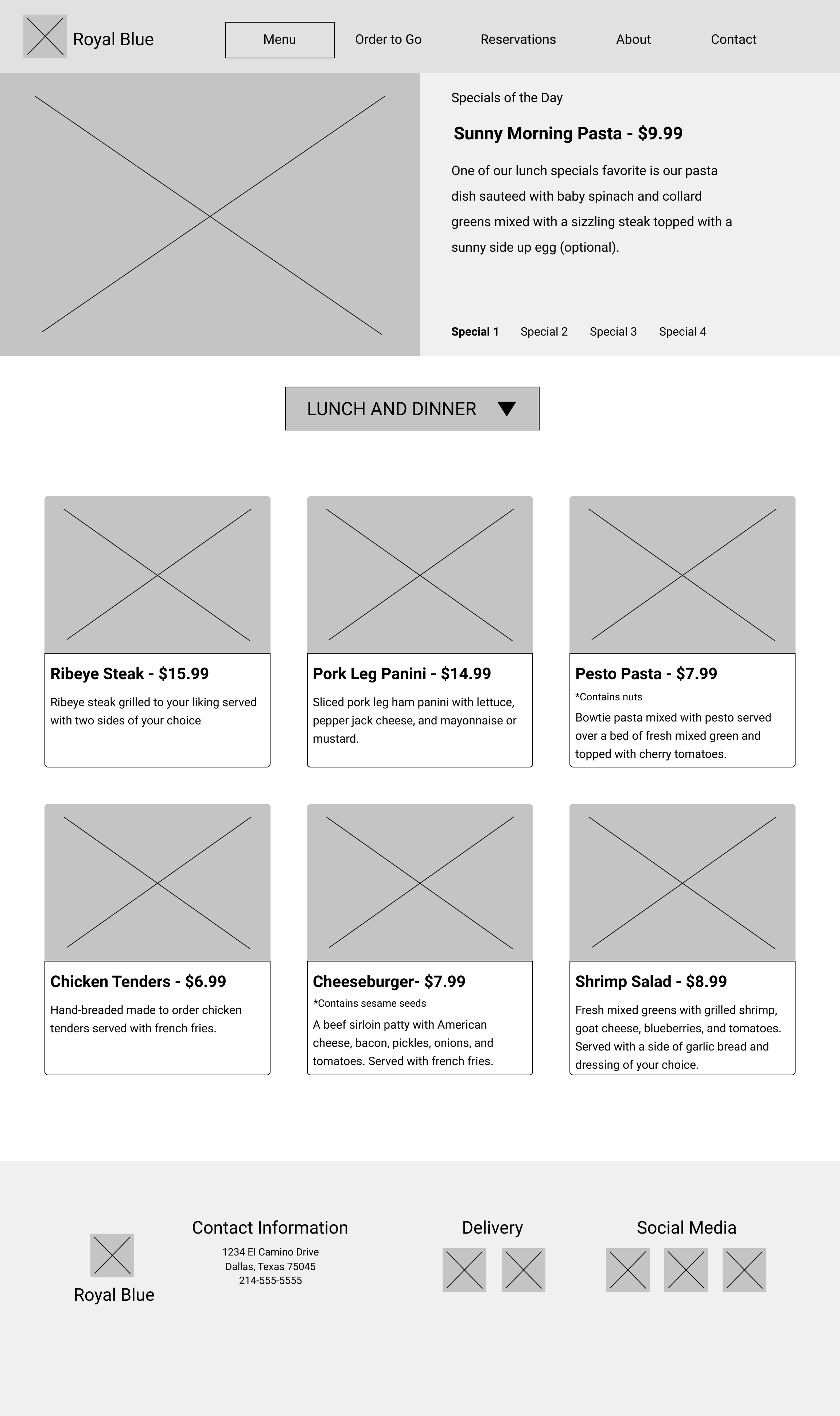
The next pictures show the first wireframe of the landing page and the first digital wireframe created on Figma. The digital wireframe didn’t change much from the original except I decided to add a button where the positive message is displayed to direct visitors to the About page of the restaurant in case they are interested in knowing more about it.
Mockups
After submitting my work to a critique by one of the design teachers she said that she didn’t know what type of restaurant it was so that I probably needed to add a section at the top explaining that before I got into the specials of the day so the changes can be seen below. Another thing changed here was the complementary typeface, since first I had Playfair Display as the complementary font to be used only on parts where I needed to use a bigger font but the teacher said that it had some parts that were really thin and it didn’t quite work when I use a picture in the background since it had too much going on it didn’t make the font look good. She suggested to use my primary font, Josefin Sans, for those parts and to find a complementary font that worked better. The grading team also told me that making my buttons the same width and height on all my pages would improve my design. And the final revision I made to version two was to also add the hours to the footer and removing the logo from it and also make the icons horizontally instead of vertically.

I also asked my peers their opinion on my design of the website and one of them suggested that the menu was too short that it almost didn’t look like it was for a restaurant and she didn’t know what the dropdown menu was for so for that part I decided to add an appetizers section to the menu that way it would show the design a little more interactive. Below are version one and version two of the mockups
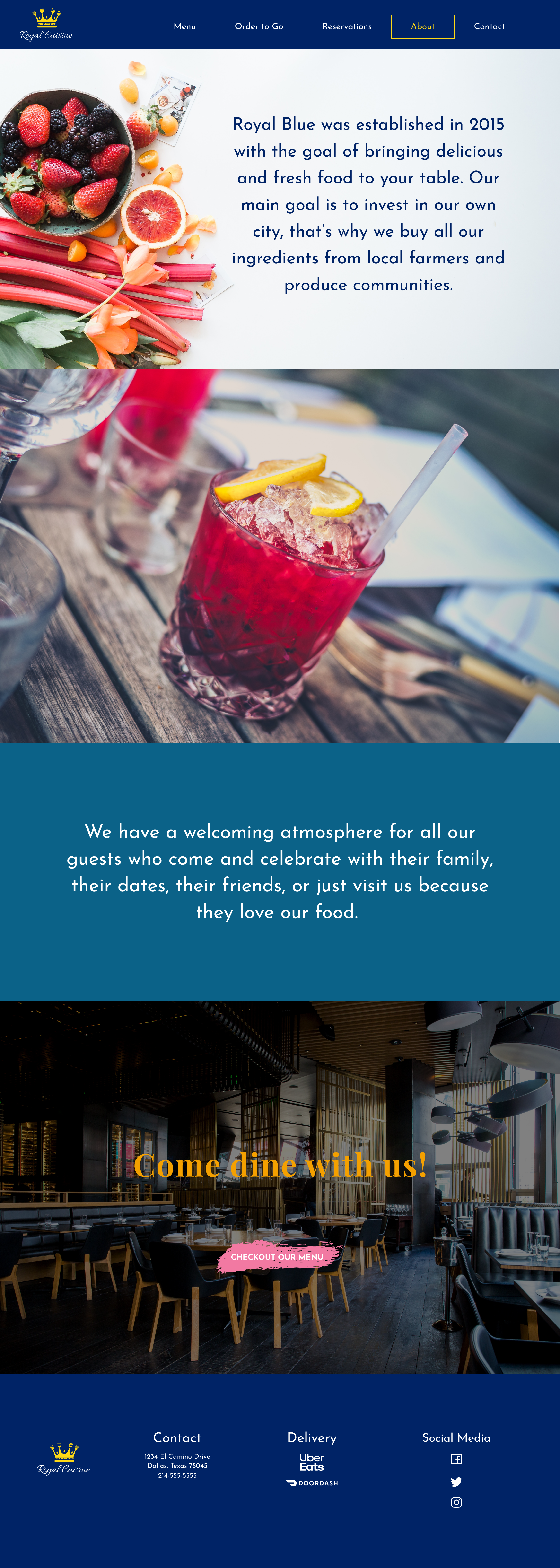
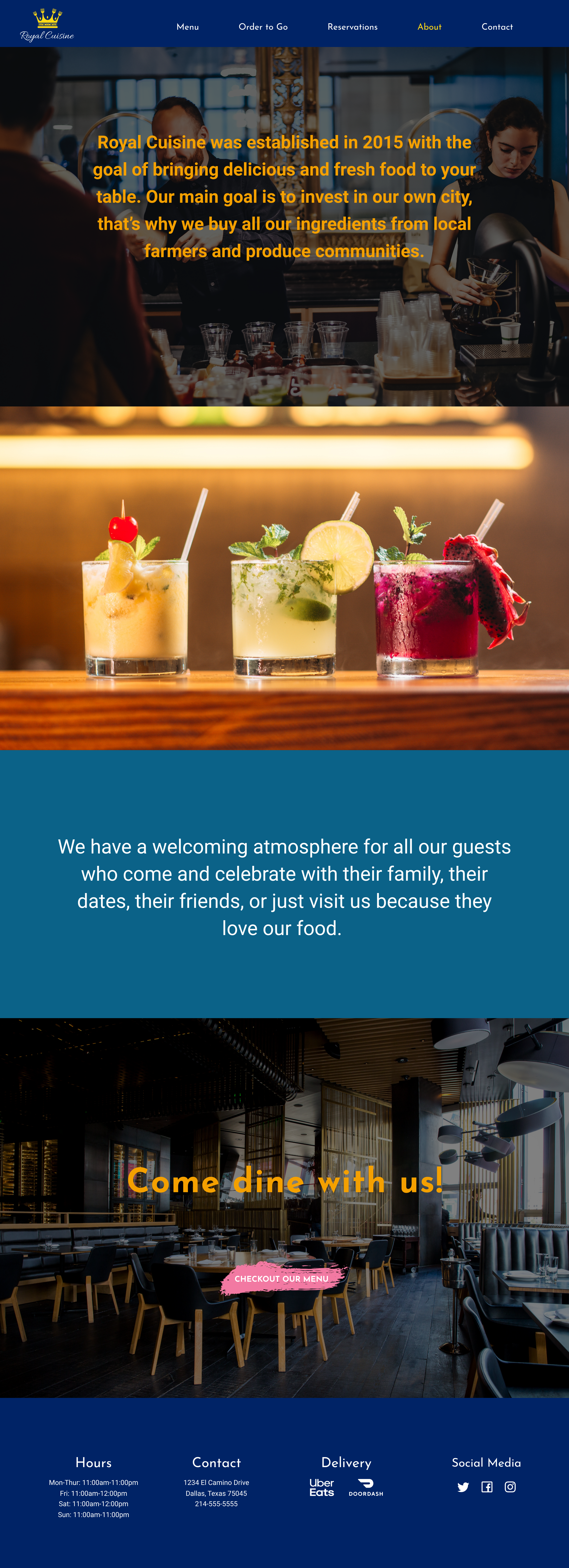
One more suggestion I got was that the images on the About page didn’t seem to match the ambiance of the restaurant and that the first picture didn’t compliment the second picture so for that part I decided to change both pictures which had the same kind of ambiance to give the About page a better look.
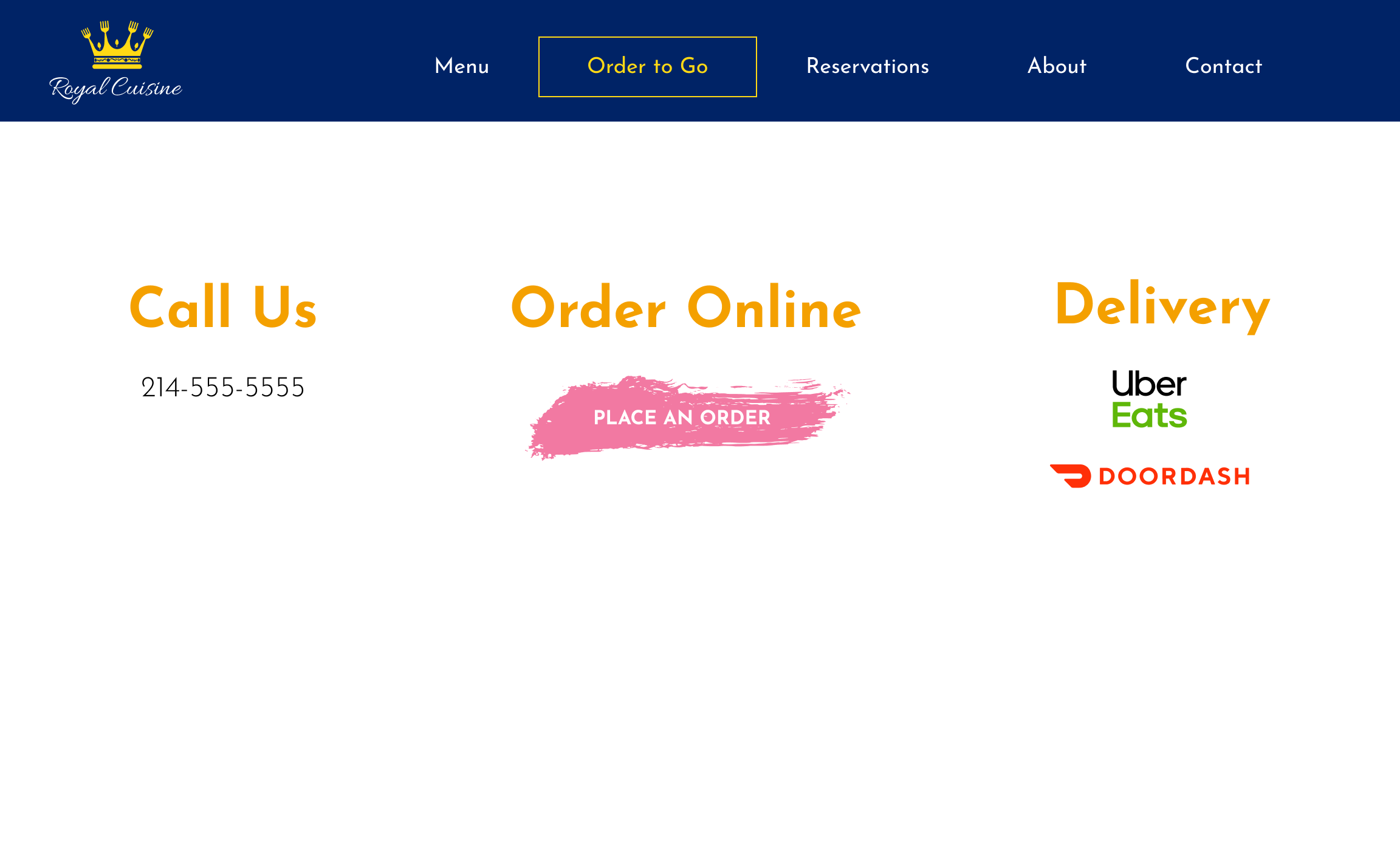
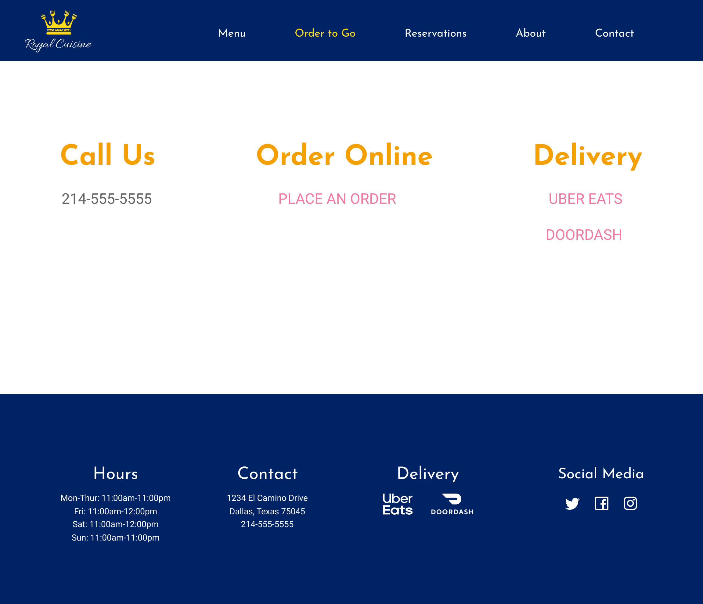
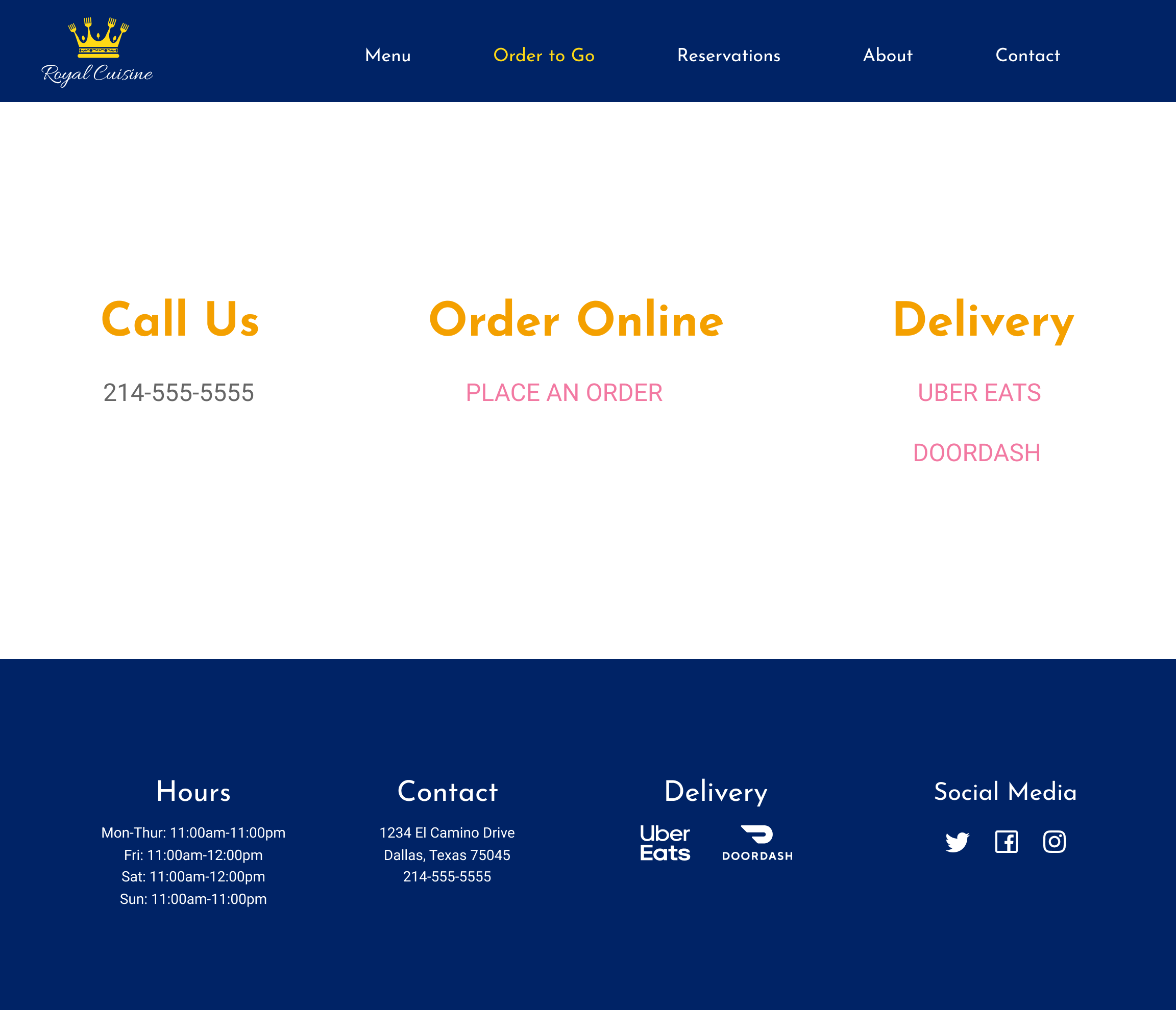
After submitting my design to the grading team they suggested removing the buttons from the order to go page, the reservations page, and the contact page since they look awkward and instead to go for clickable written links. Another suggestion he gave was to add the same footer to these pages as well.

Branding
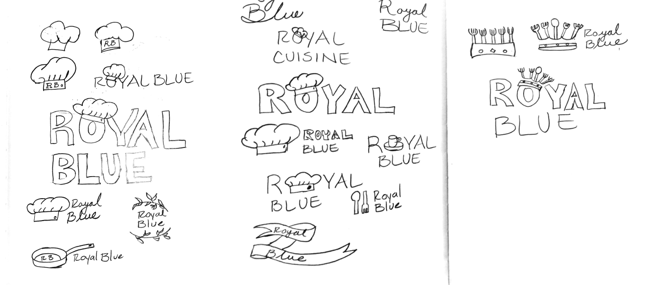
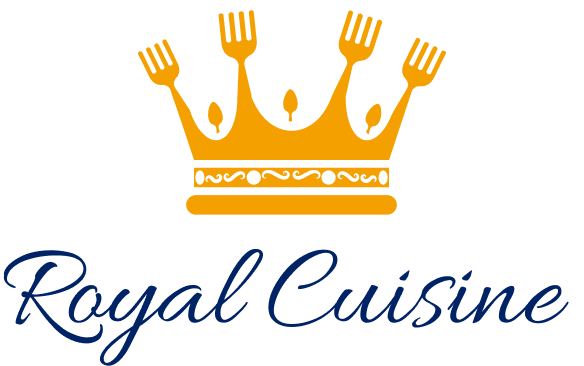
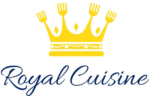
When I first started my sketching for the logo I used the name of the restaurant as Royal Blue and I had this idea that I wanted to make a chef’s hat kind of like a crown that would sit on the “O” of Royal but seeing it drawn didn’t make it seem right. So then I moved onto just adding the name of the restaurant next to a chef’s hat, eventually, I changed the hat for a pan but nothing seemed to work out. Then I got this idea that since I wanted the name to be Royal maybe adding a crown and replacing its’ peeks with forks and spoons would actually work so after I digitize that version I found that the crown looked better if I made all the peeks forks and added the spoons in the middle to make them look like jewels. After that, I just had to find the perfect font to compliment the name of the restaurant and it was at this time that I decided the name Royal Cuisine sounded better than Royal Blue so I changed it. Below are the sketches of the logo and the final design of the logo.
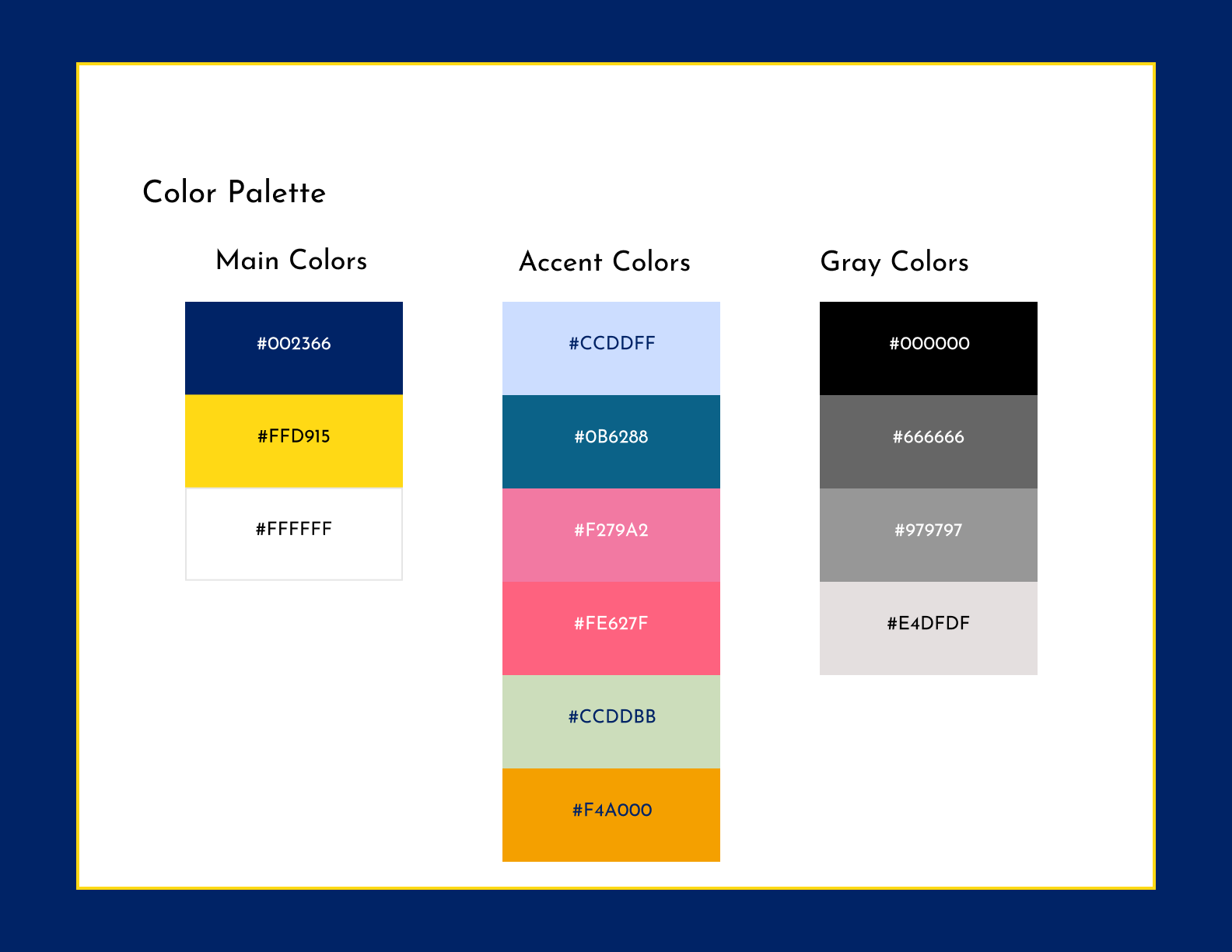
Color Palette
For my color palette, I chose royal blue to accentuate the name of the restaurant since blue represents royalty and then a complementary shade of yellow for the crown since these colors work well together. I also chose white as the main color since when using the logo on a darker background the blue that was going to be used in the name of the restaurant would get lost so in this case, changing the color of the restaurant from blue to white seems appropriate.
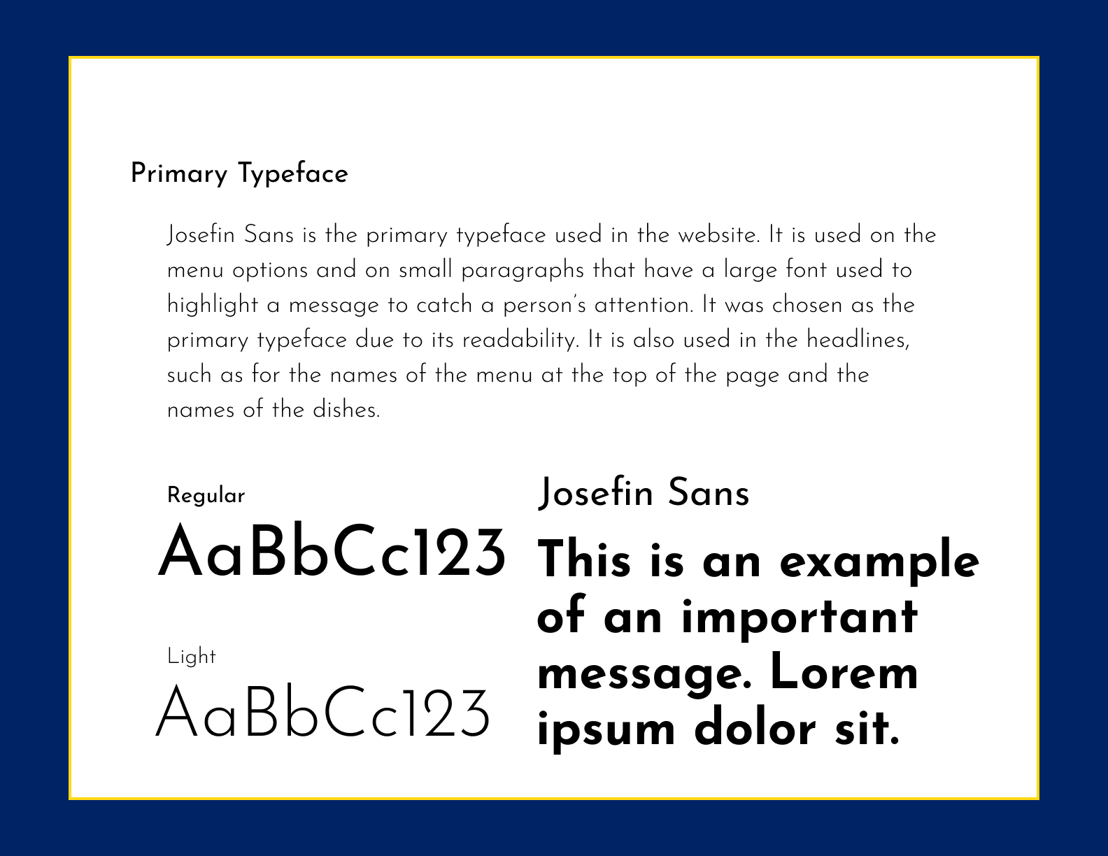
Typography
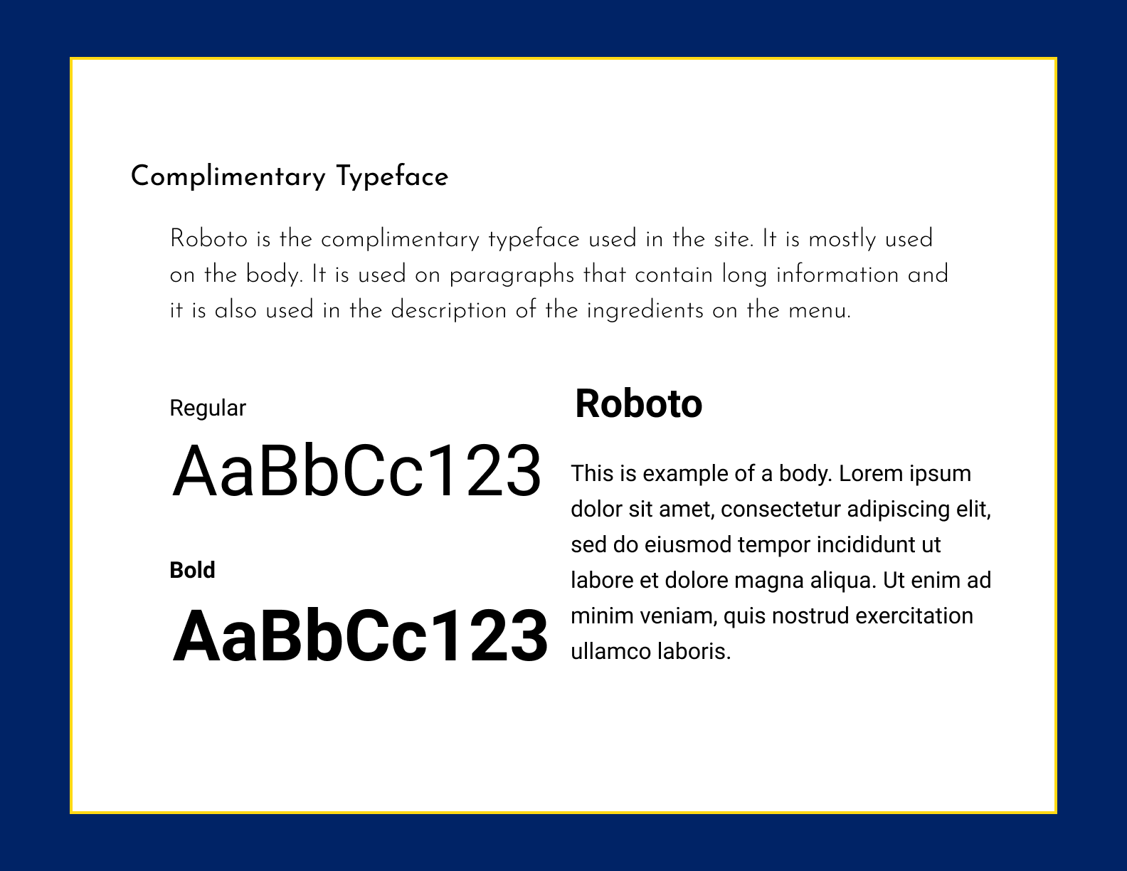
The font I chose to use as the primary typeface is Josefin Sans and the complementary font was Roboto. These fonts complement each other well since they both are easy to read but Josefin Sans works better to be used on the headings and bodies that contain a small amount of text and Roboto works well when reading long paragraphs of text.
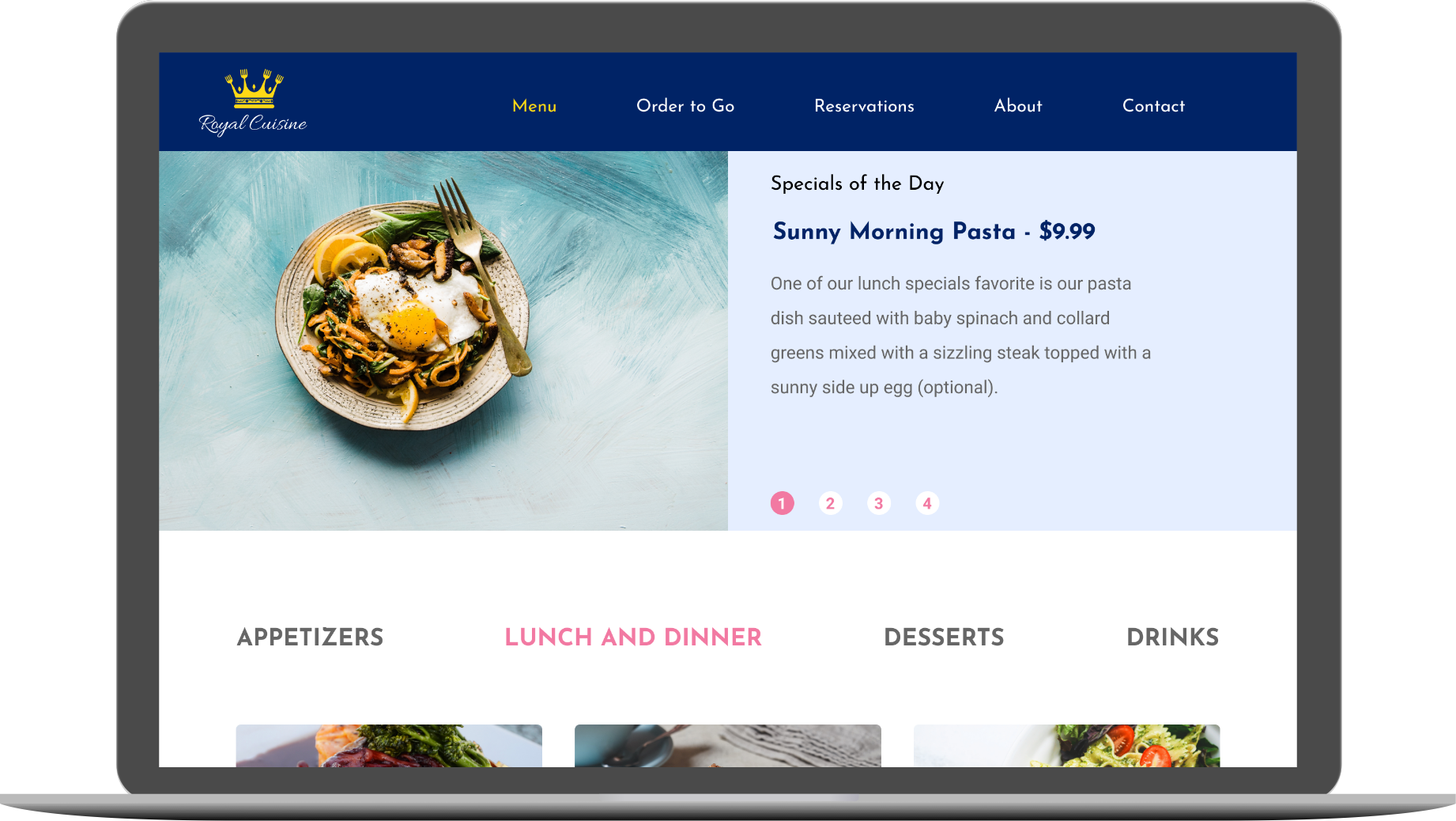
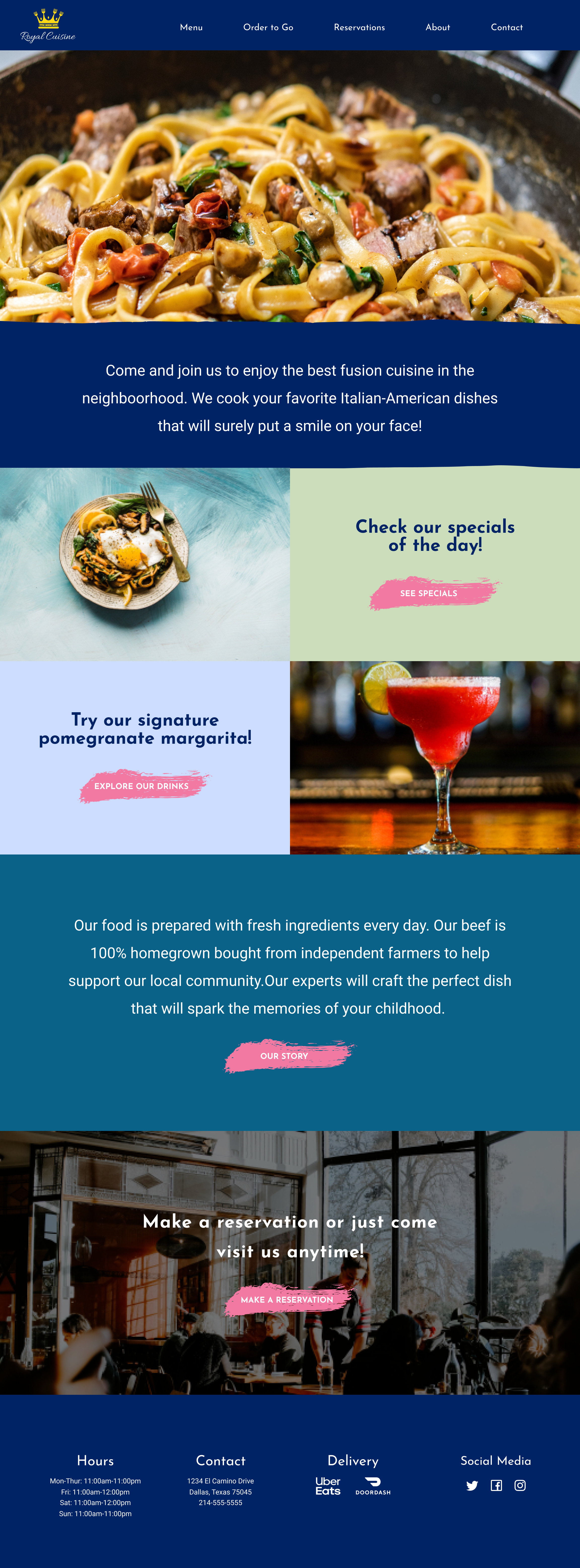
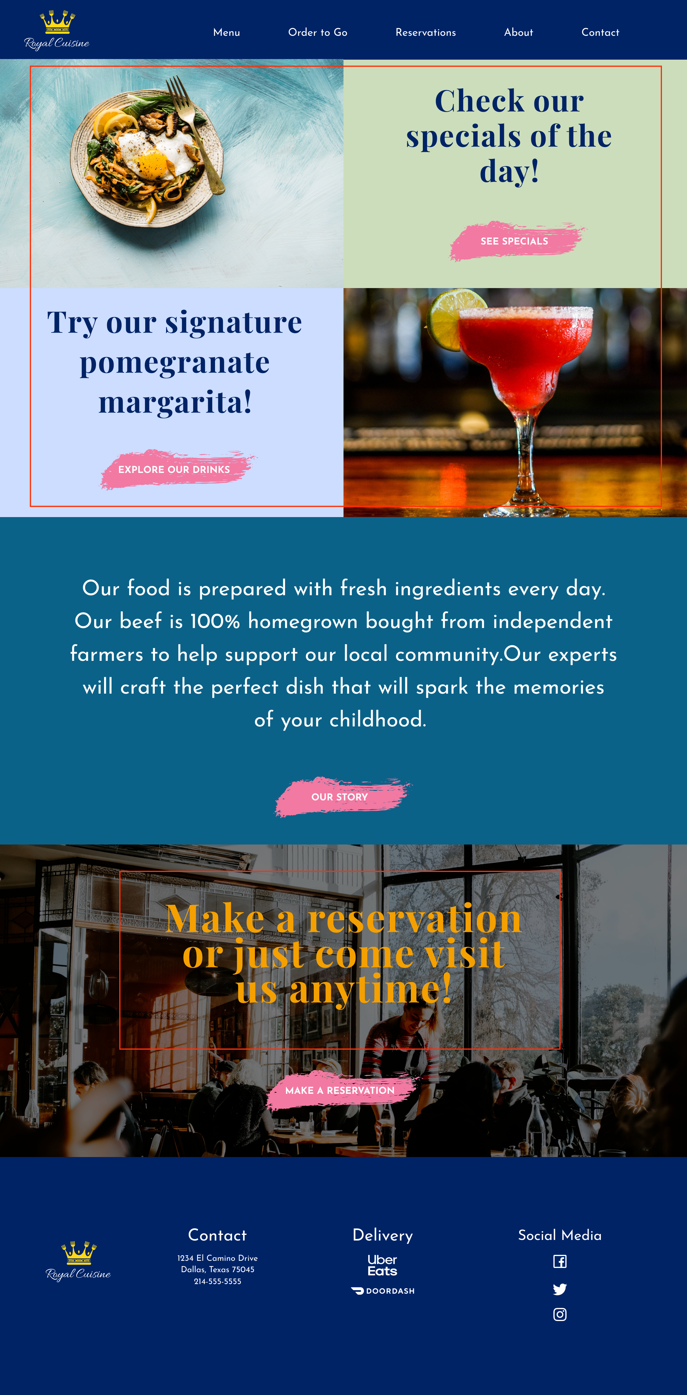
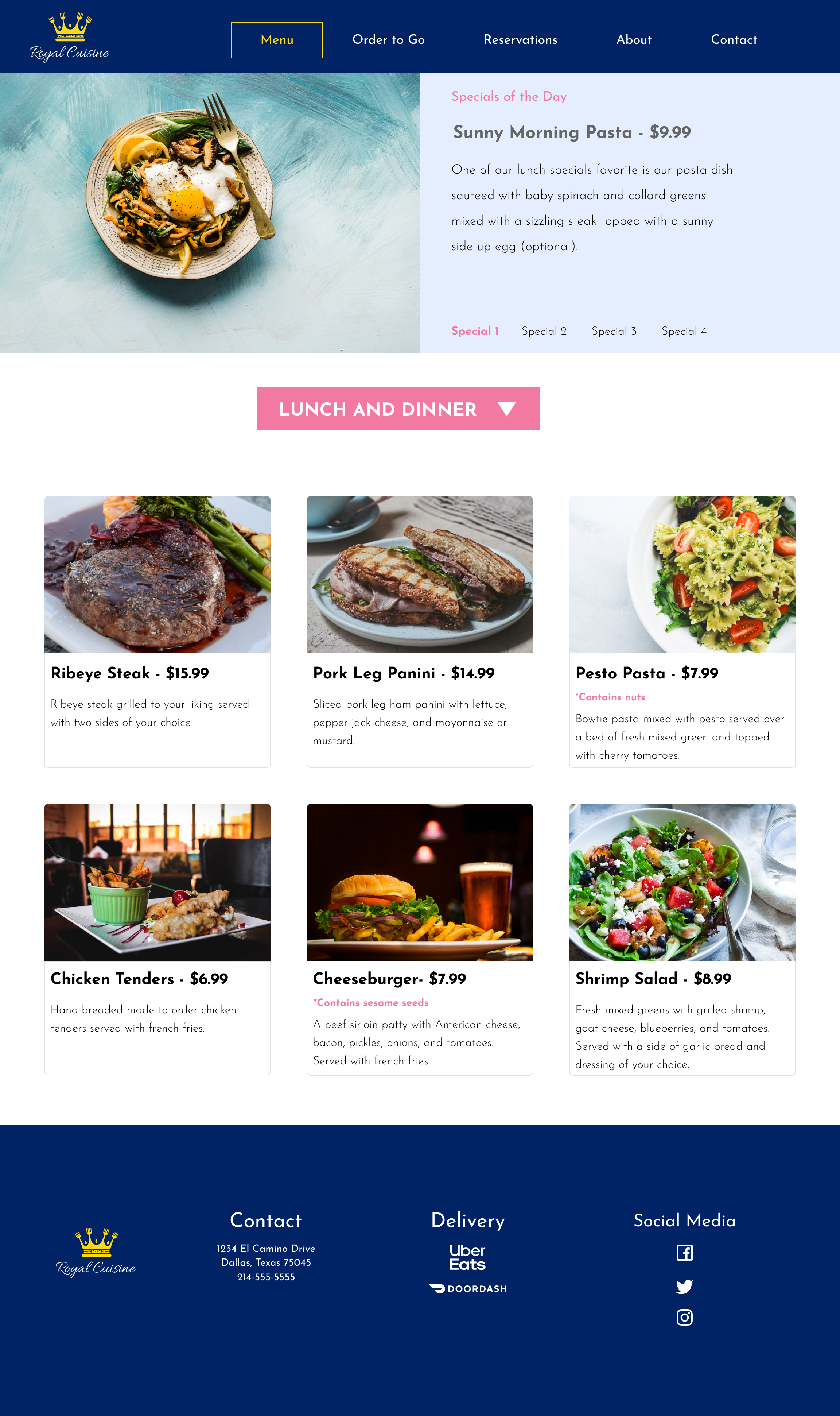
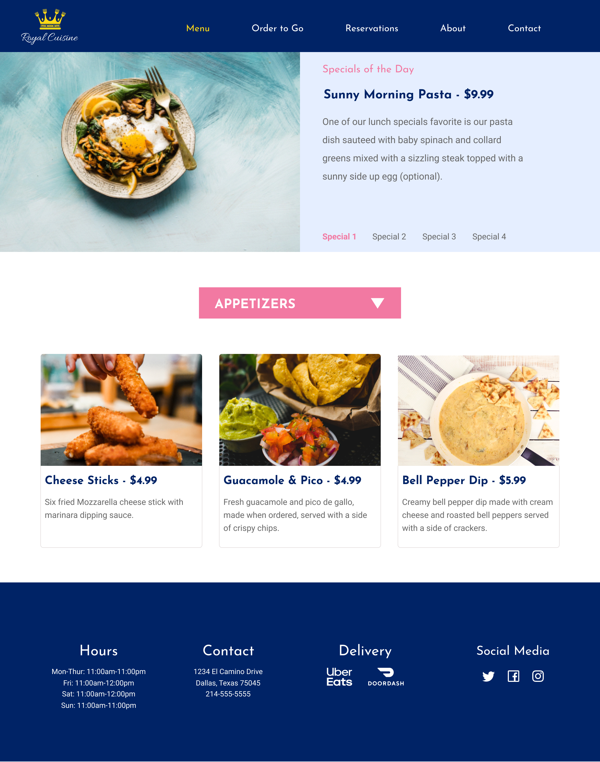
High Fidelity Prototype
Below is the final version of the prototype for Royal Cuisine Restaurant. The images below show the final look for the landing page and the menu page for the restaurant. To check the prototype in detail click on the button below the images. The steps for all the changes that I performed to get to this final version will be explained in more detail in the next section.
User Testing Results
For the usability testing, I tested three subjects on site. They took an average of seven minutes to do the tasks I asked them to perform which were:
- Find the menu
- Find the specials
- Find the appetizers
- Find the story of the restaurant
- Find the story of the restaurant
Changes Applied
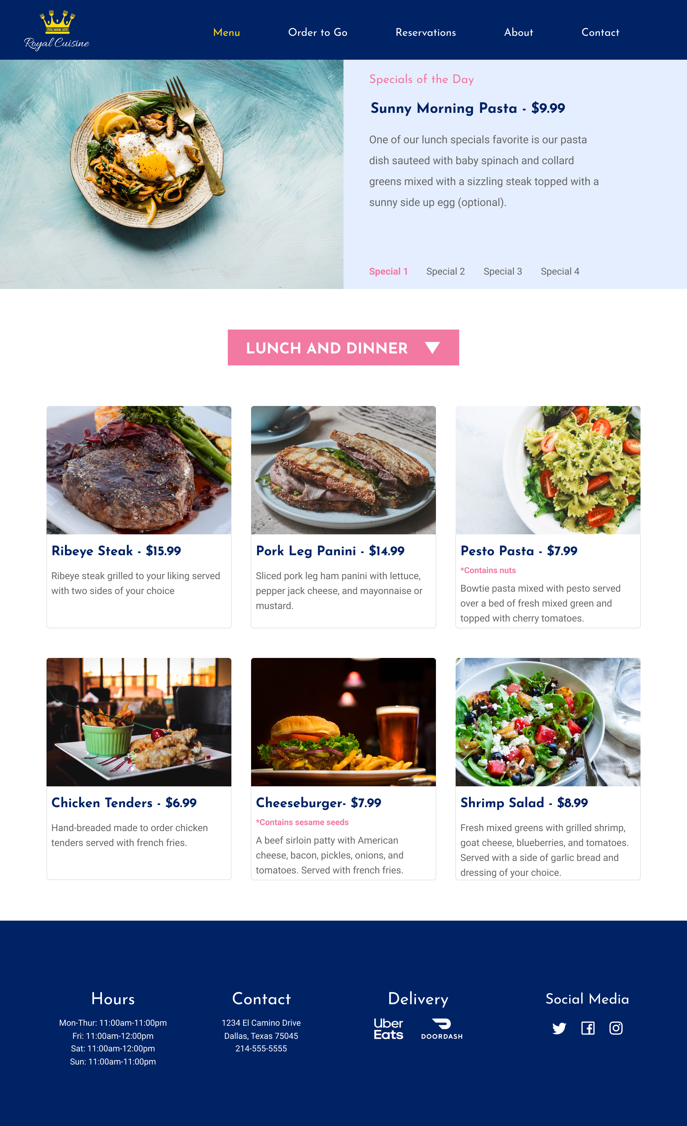
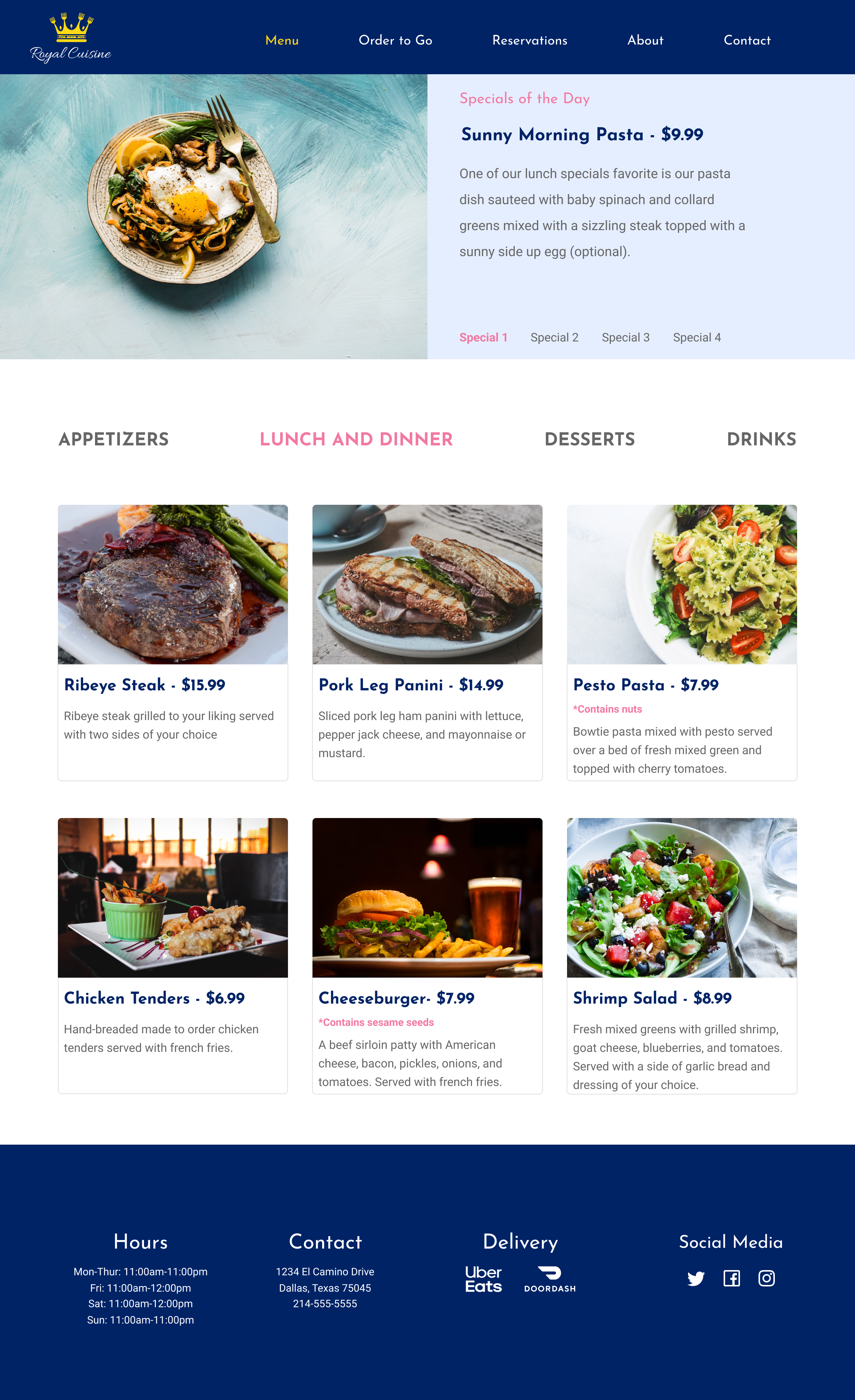
One of the subjects couldn’t find the appetizers at all so she gave up and I had to move onto the next task. The second subject also had difficulty finding the appetizers and browse until she could figure out where she would find them. The third subject had no problem with this task or any of the rest. Seeing as two of the three subjects had a hard time finding the appetizers I had to revise that section of my design. Instead of a dropdown menu, I chose to display the options for the menu on a row headline style and just highlight the section that was in use while muting those who weren’t.
Other changes that were suggested by the grading team was to vertically align my information on the white space of the pages of orders to go, reservations, and contact to make the design look better. Below is the image for Orders to Go page before and after.
One more change suggested by the grading team was to make the specials part of the menu into an ellipse style.
Conclusion
With this project I managed to design a website that contained all the parts needed to satisfy the needs of the client. The MVP I designed contained some of the most important features the people surveyed thought it was important on a restaurant, such as a full menu with pictures, ingredients, and prices, as well as the contact information and the hours of the business.
One of the things I still need to remember is to align better ‘cause that seemed to be a pattern I was told to revise when submitting my project for revision. Overall, this design didn’t require such big changes that would make me spend lots of extra time in it so with constant practice I think I will eventually remember to not make small mistakes that can ruin the whole design.